
Client
Skinattention by sarah
Year
2025
Market
GCC — Saudi Arabia, UAE, Kuwait, Bahrain
Services
-
The Brief
Skinattention is a skincare brand by founder Sarah, built for the Gulf market and expanding across the GCC, Saudi Arabia, UAE, Kuwait, Bahrain, with international ambitions from day one. Sarah came to Loverboy Studio for a full brand identity, one that could speak in two languages and put the climate itself into the product story, not just the ingredients list.
The Challenge
Two requirements had to hold at once. The identity needed to run bilingual, English and Arabic carrying equal weight, equal clarity, nothing feeling like a translation bolted onto the original. And it needed to make Gulf heat and humidity part of the brand's logic, not a backdrop, without falling into desert cliché or losing the clinical trust a skincare brand depends on. Most regional beauty brands pick a lane, heritage or science, Arabic or English. Skinattention needed both, running natively, at the same time.
What We Did
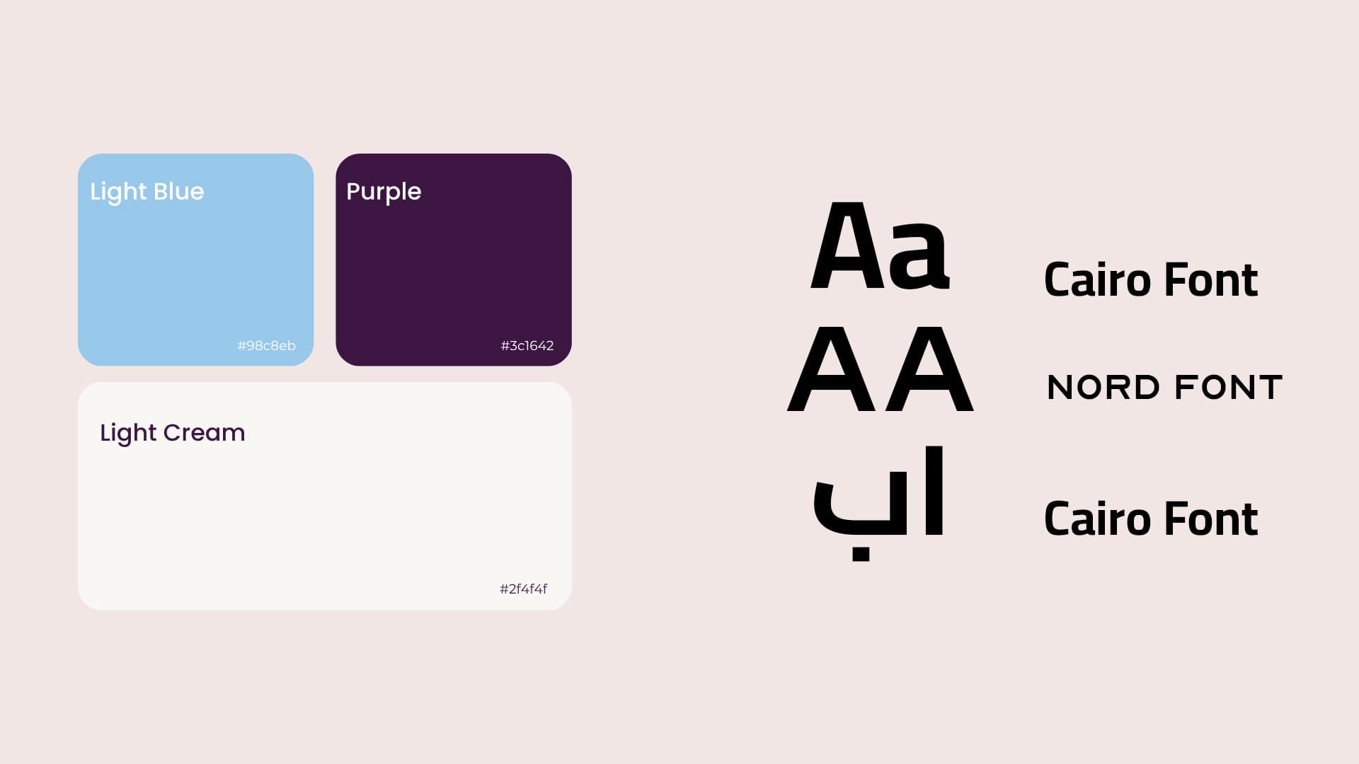
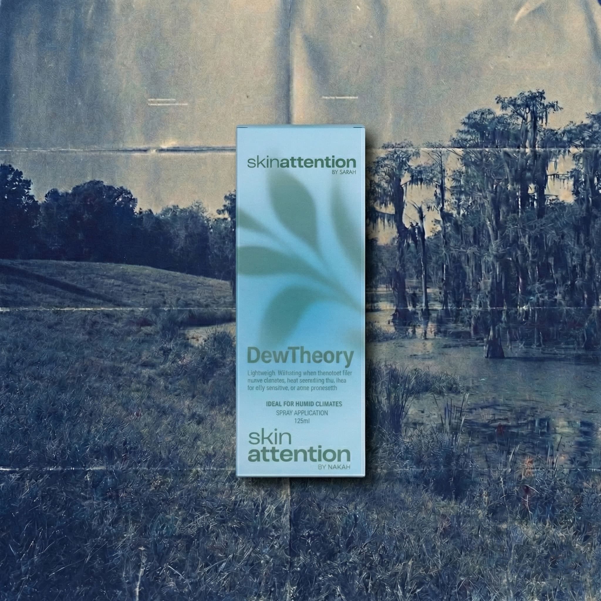
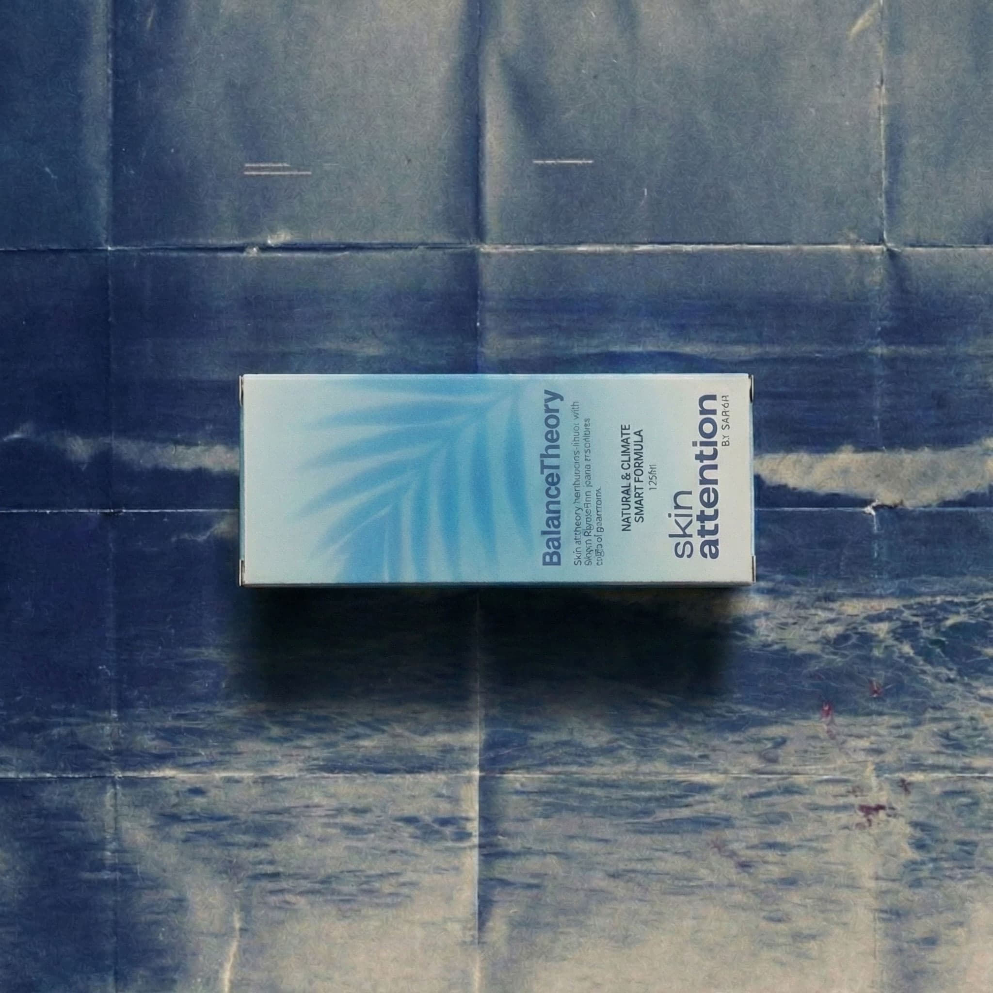
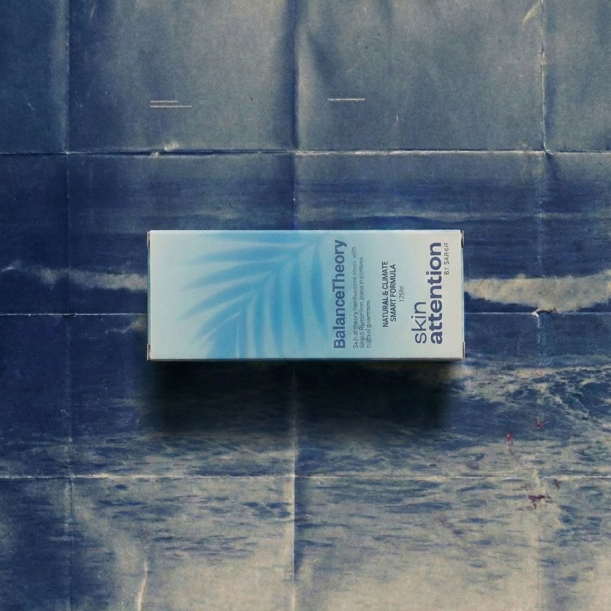
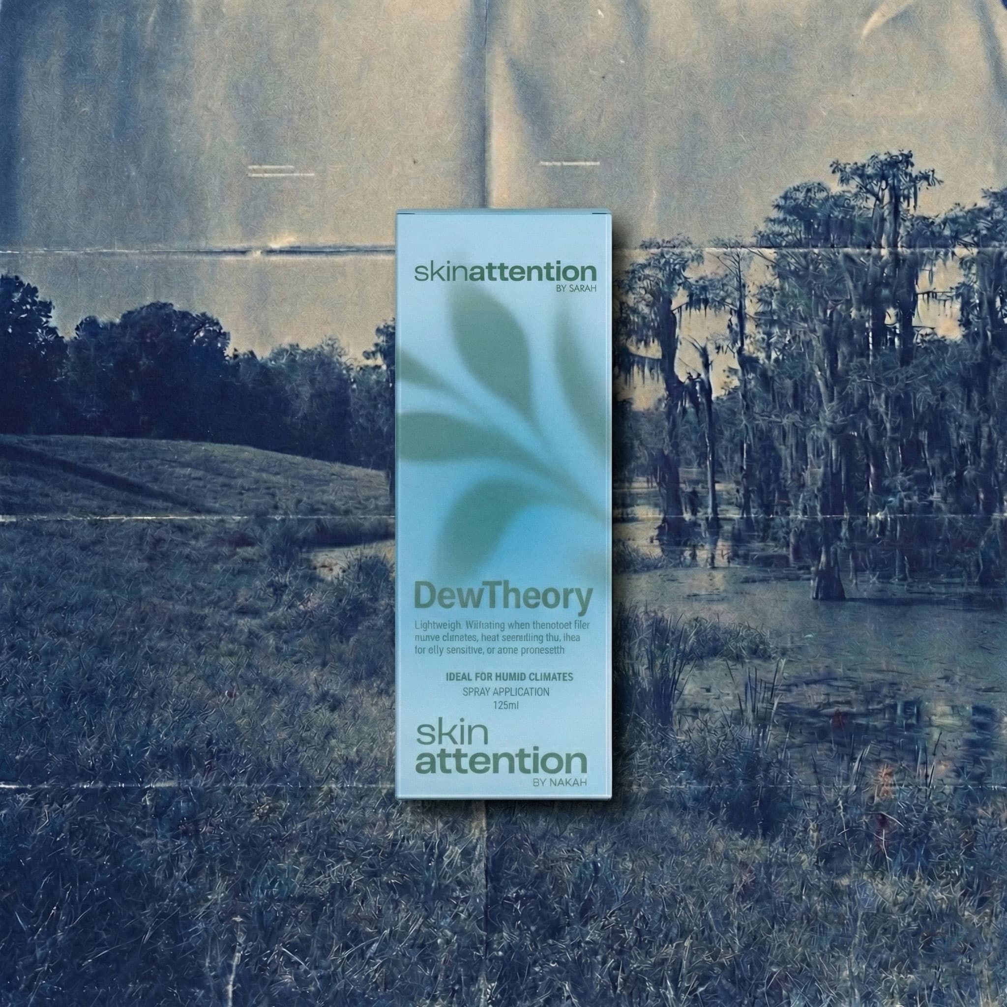
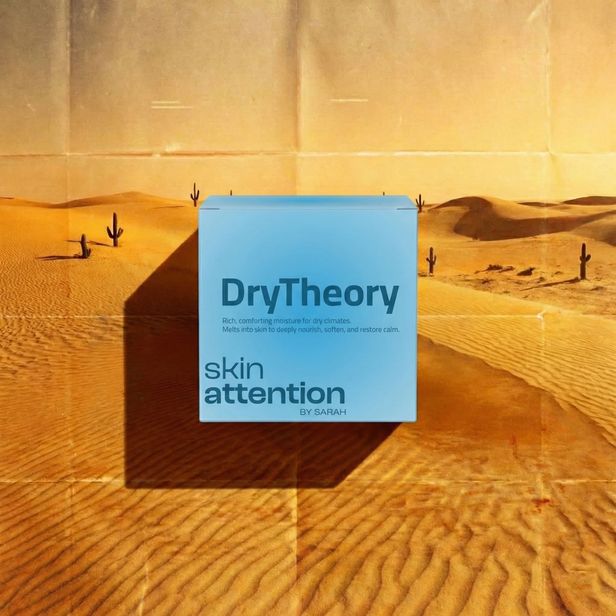
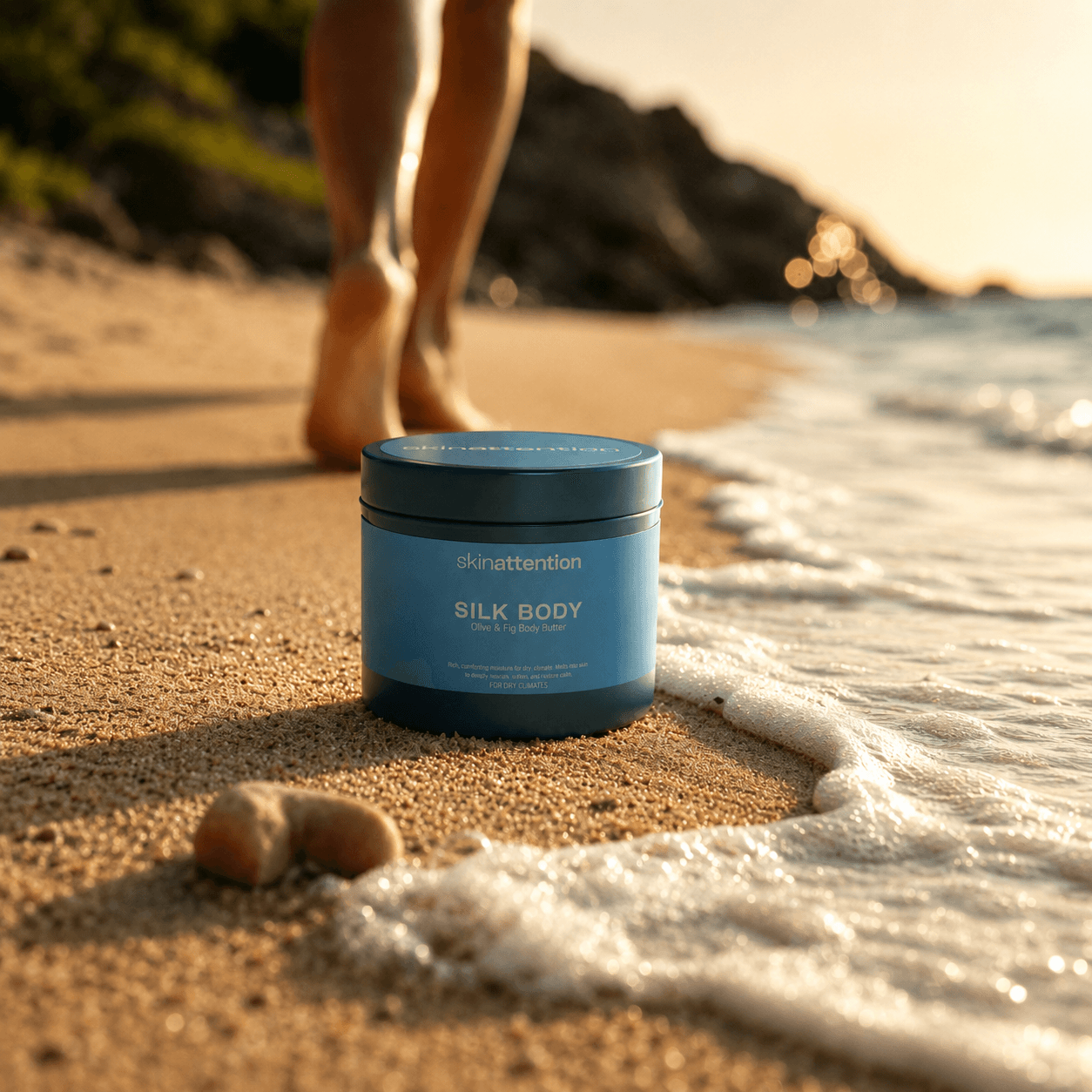
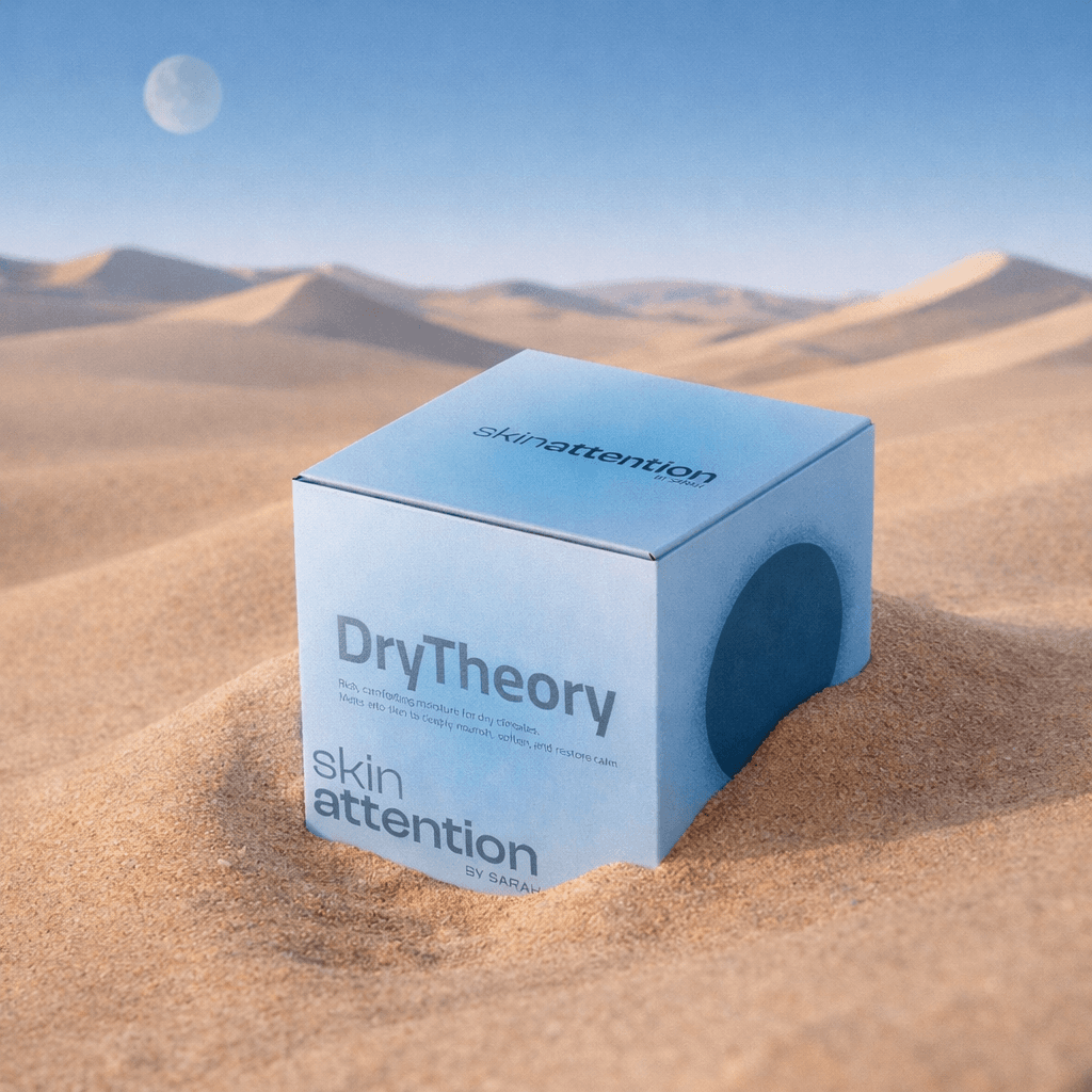
We built the identity around one idea: Made For Here. Here means home, and home is wherever the product travels, Riyadh, Dubai, Jeddah, wherever the heat and humidity shape the day. That line became the spine of everything else. We gave the brand a Caregiver core with a Sage's credibility, climate-smart formulations, full ingredient transparency, no greenwashing, built for people who want their skincare to understand their weather as well as their skin. The clearest proof of that thinking sits in the product naming. Every formula is named for the climate problem it solves, DryTheory for dry-climate body butter, DewTheory for humid-climate lotion, BalanceTheory for the hand cream in between. The climate story isn't a tagline sitting on top of the product, it's baked into what each product is called. We built the full system to run natively in Cairo typeface for both English and Arabic from the start, so nothing reads as an afterthought translation, it reads as written twice, on purpose.
Built with the LoverBoy Method.
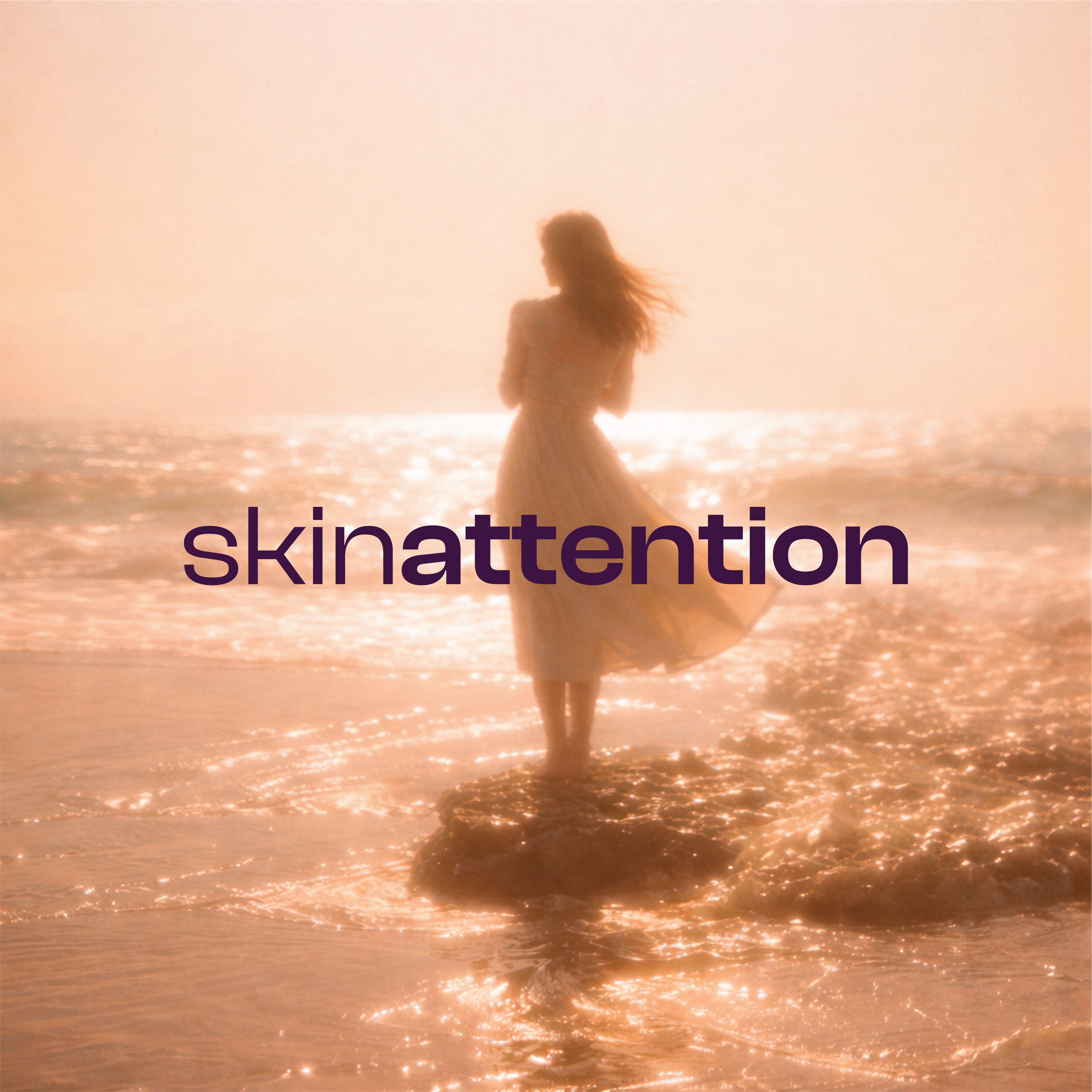
Visual Identity
Made for here. Here is wherever the product is
Packaging
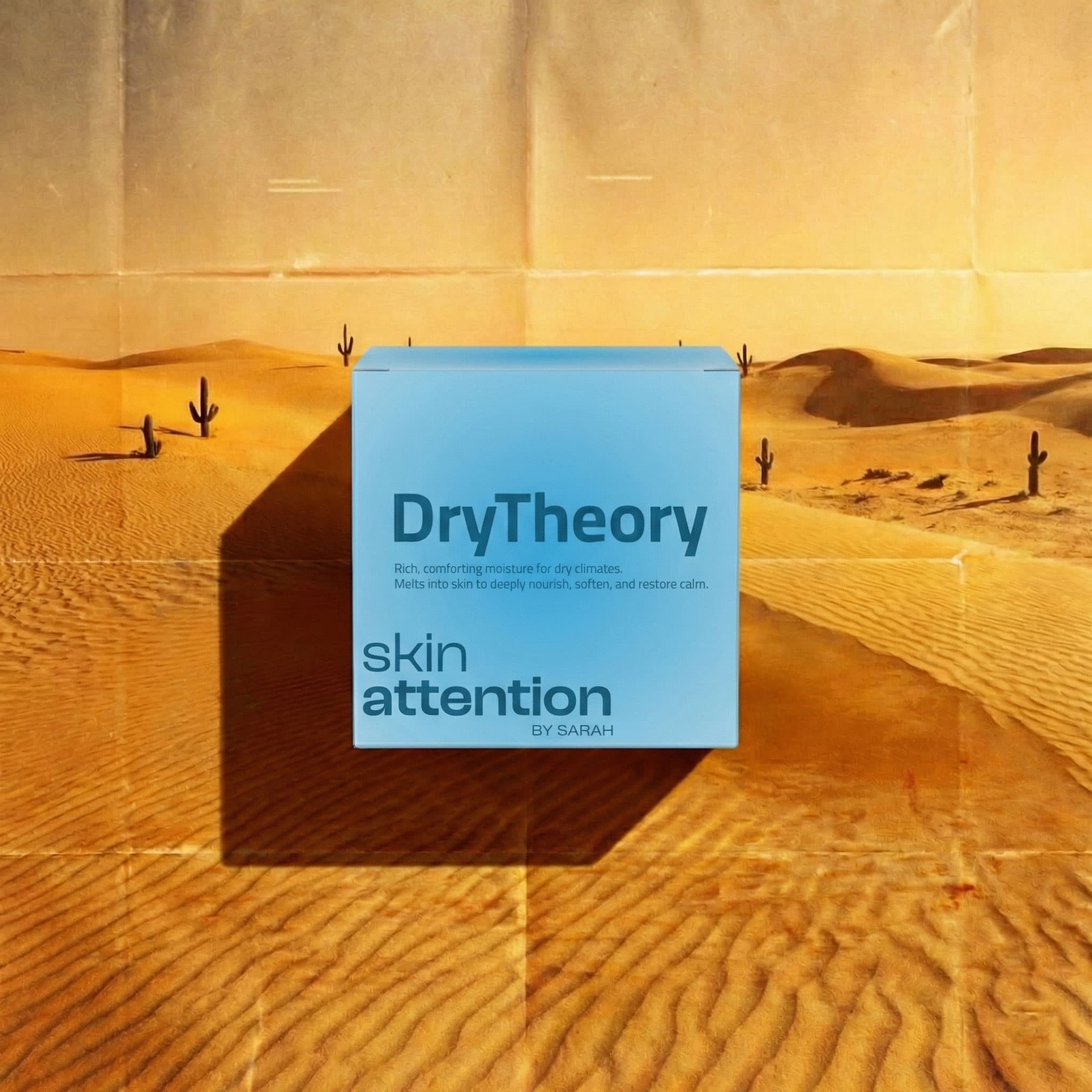
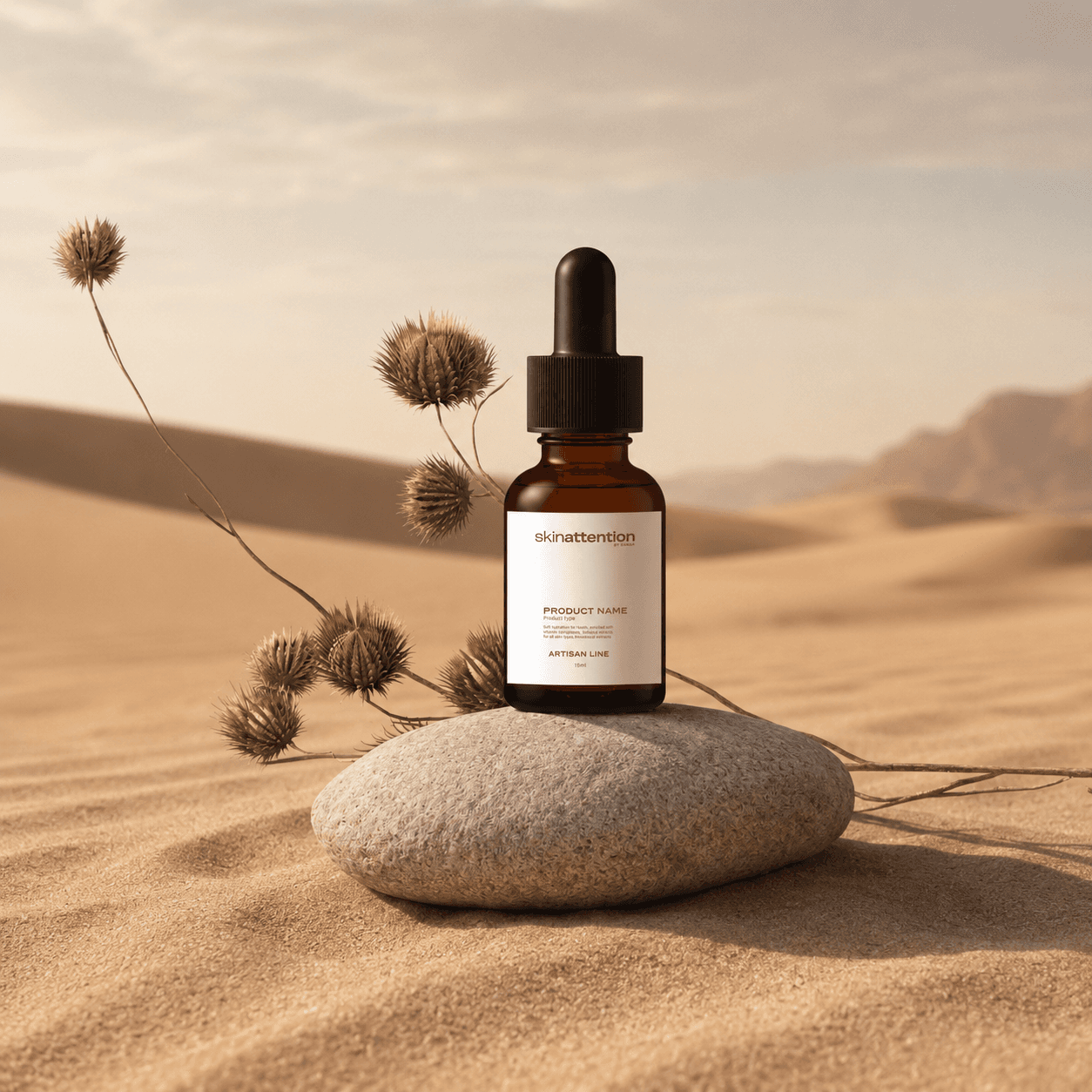
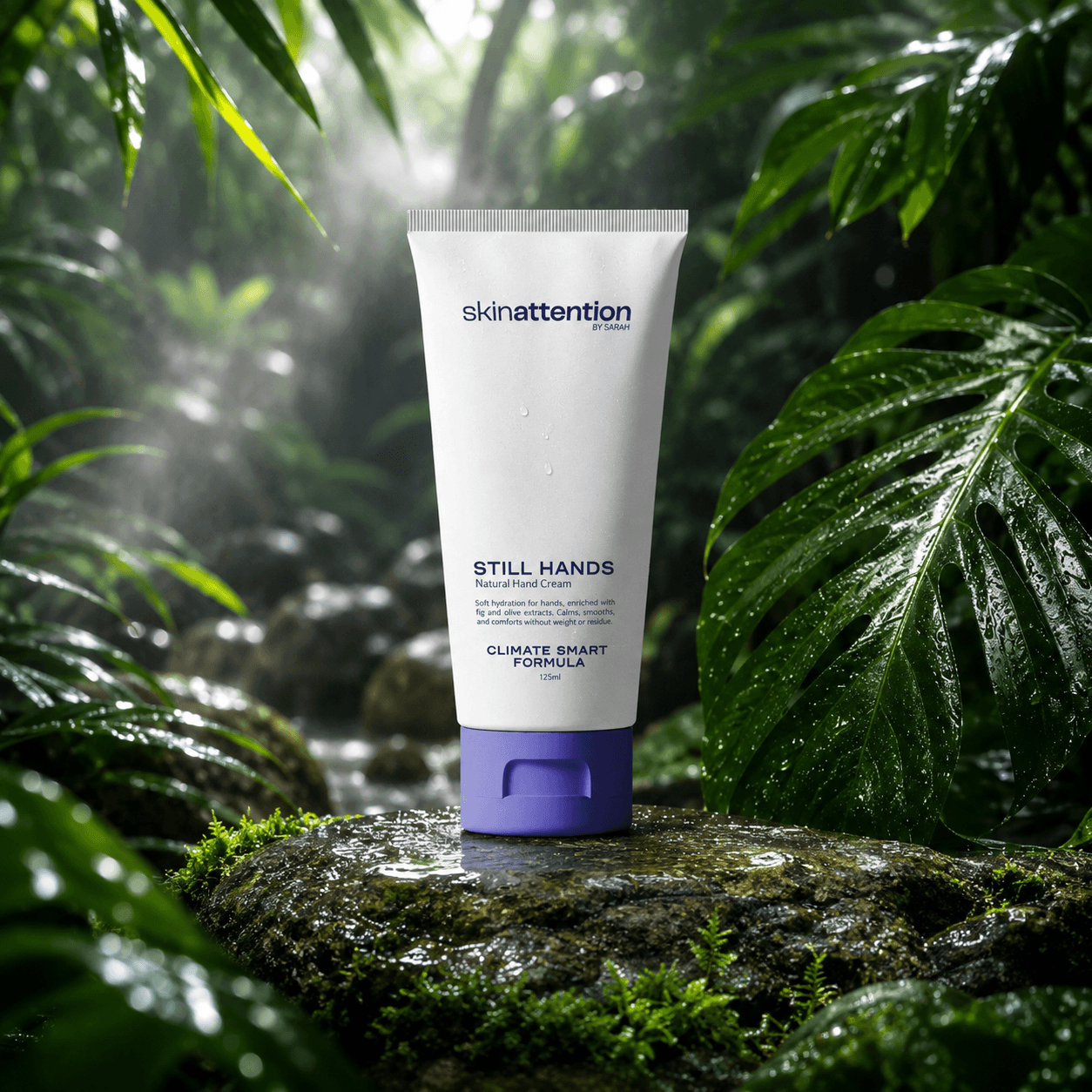
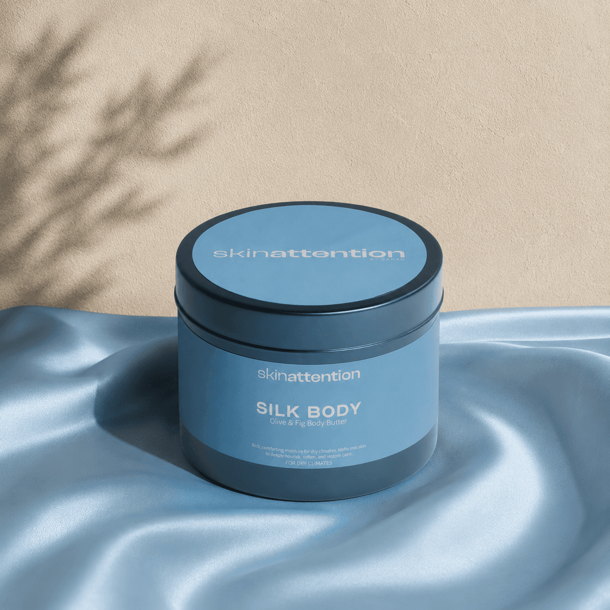
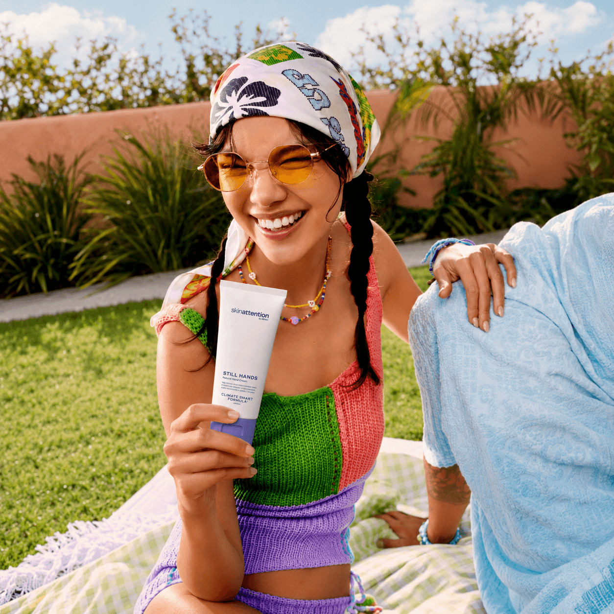
Photography
The Result
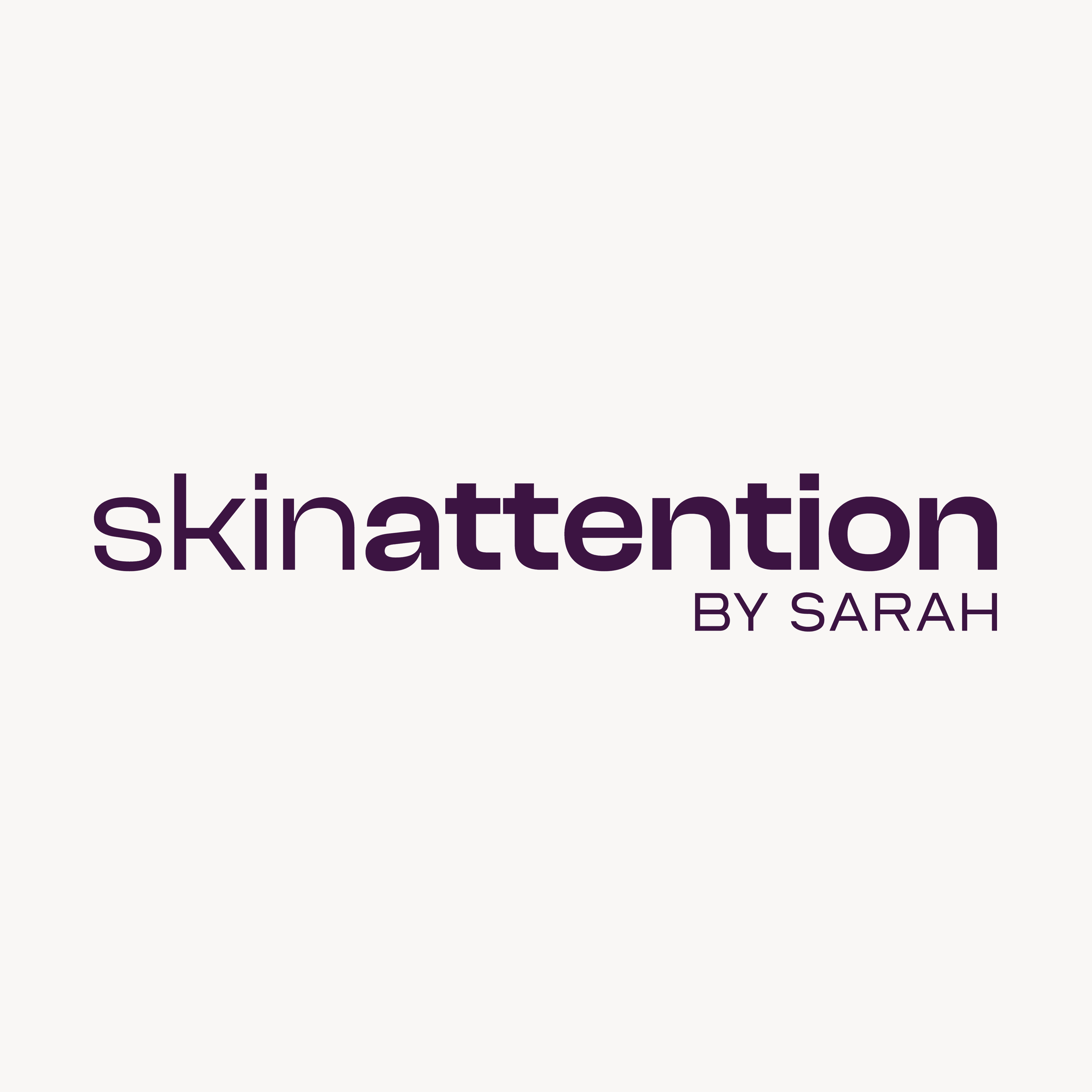
Skinattention now has an identity that behaves the way its product promises to, calm, transparent, and built for two languages and one climate story from the ground up. The wordmark carries hierarchy without leaning on color or decoration. The naming system turns a marketing claim into product architecture. And the whole thing flexes from a hand cream tube to a dropper bottle to a shopping bag without ever feeling stretched thin. It reads like a brand that already belonged to the Gulf, because it was built from the climate outward, not dressed up to look local after the fact.

Like what you see?