Client
Blue Brunch
Year
2026
Market
Jeddah - KSA
Services
The Brief
Blue Brunch is a premium-casual brunch café in Jeddah. The team behind it had been running the city's L'Éclair de Génie franchise and decided to stop operating someone else's name and build their own. They came to us for everything a new brand needs: strategy, name expression, identity, packaging, art direction and a launch plan and their interior design
The Challenge
A franchise comes with borrowed equity. Walk away from it and you start at zero, in a city with no shortage of beautiful cafés. Jeddah's premium scene splits two ways: formal places too stiff to visit twice a week, and trendy places that look better on Instagram than in person. The audience we were building for is not avoiding luxury. They are avoiding try-hard luxury. Blue Brunch had to feel as considered as the French patisserie it was replacing, and be somewhere you would go on a Tuesday.
What We Did
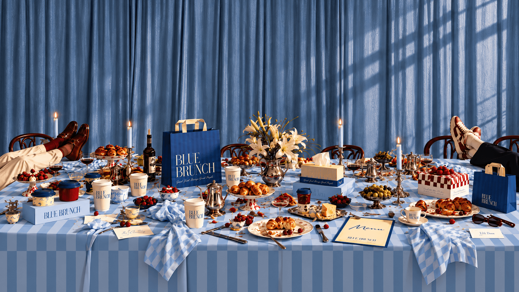
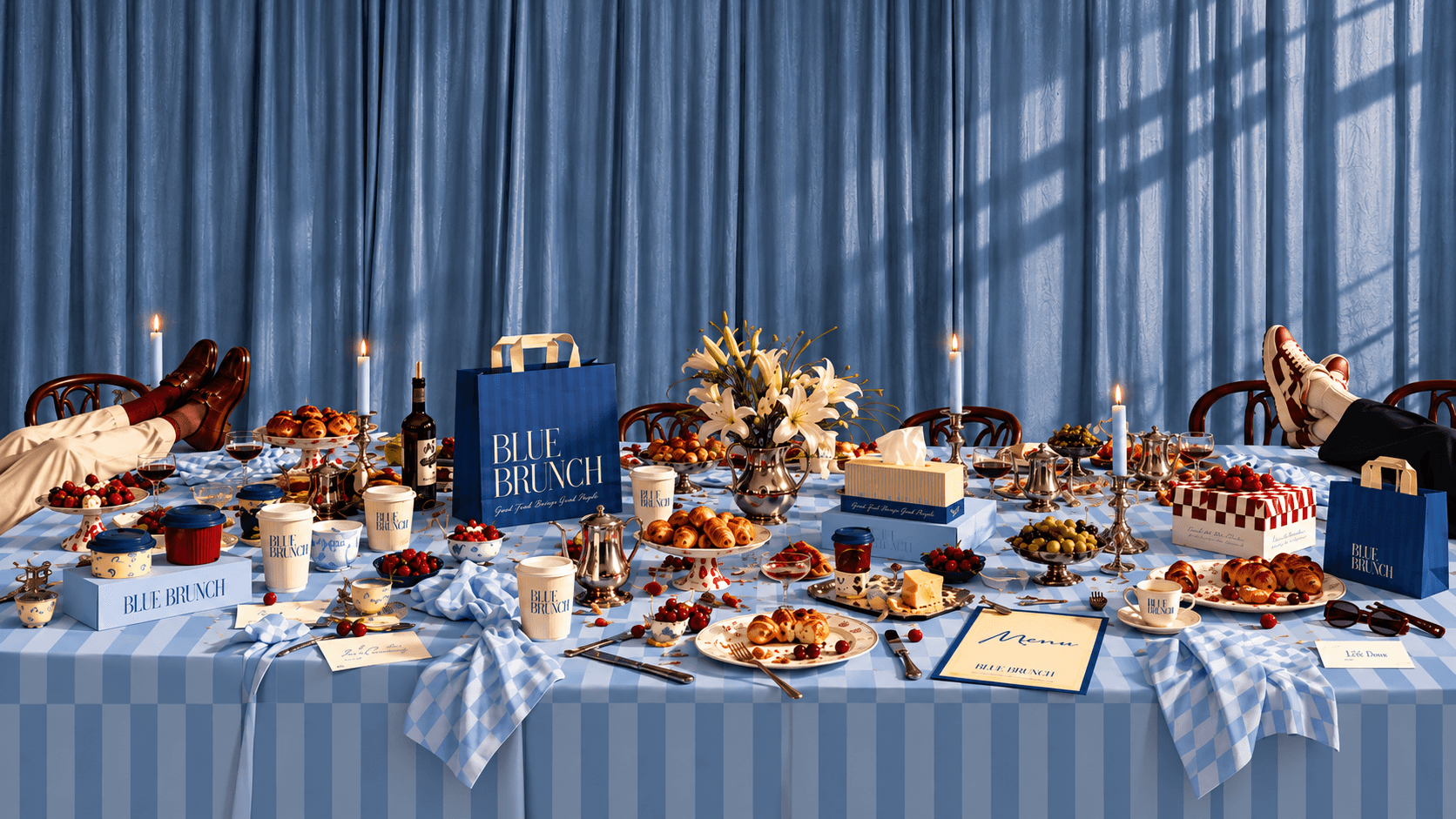
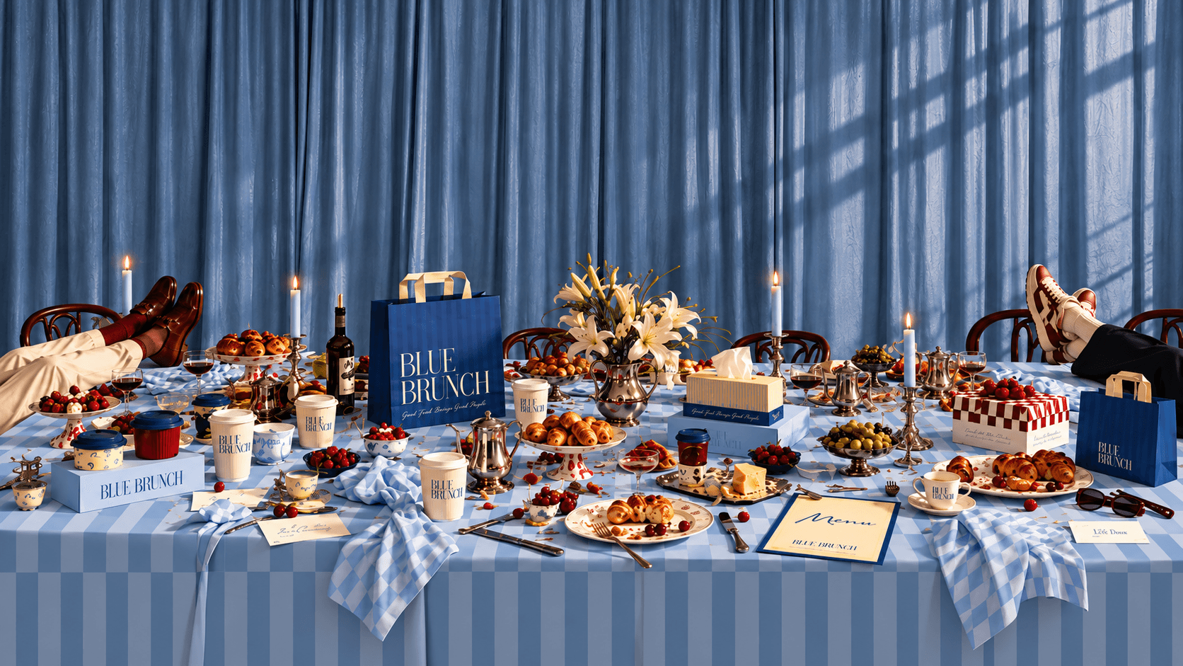
We positioned Blue Brunch as premium without the performance, and gave it one territory to own: elevated ease. The strategy pairs the Ruler with the Caregiver, high standards with soft edges. Then we turned that into a picture. A long table set with silver, candles and lilies, and someone's feet up on it. Loafers at one end, sneakers at the other. That image is the brand: a place nice enough to dress up for and relaxed enough to forget you did. From there we built the full system: brand strategy, logo suite, patterns, typography, a complete packaging range, signage, uniforms, a photography and art direction guide, a content plan for launch, and the interior, designed with OCD Studio.
Built with the LoverBoy Method.
Visual Identity
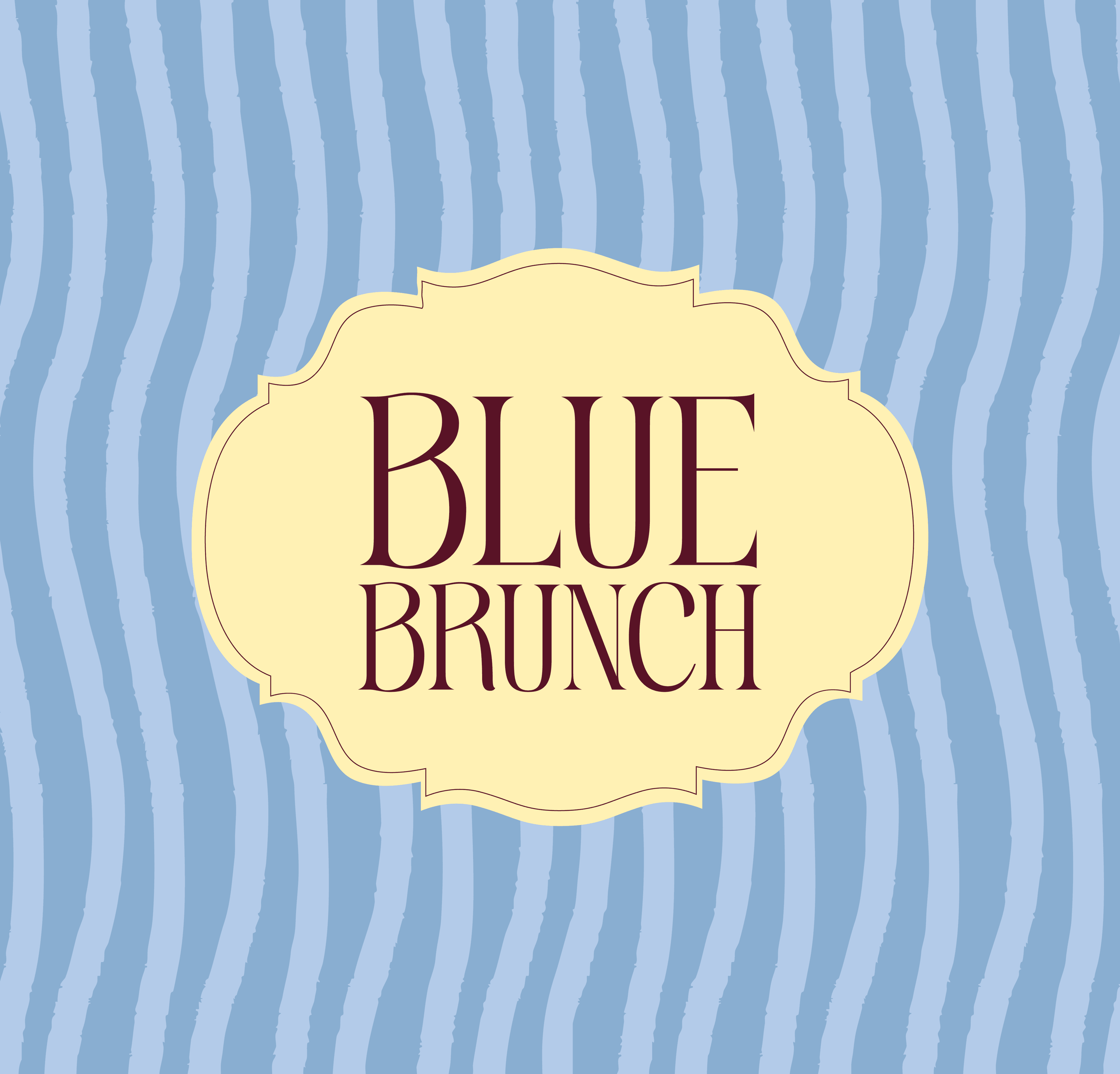
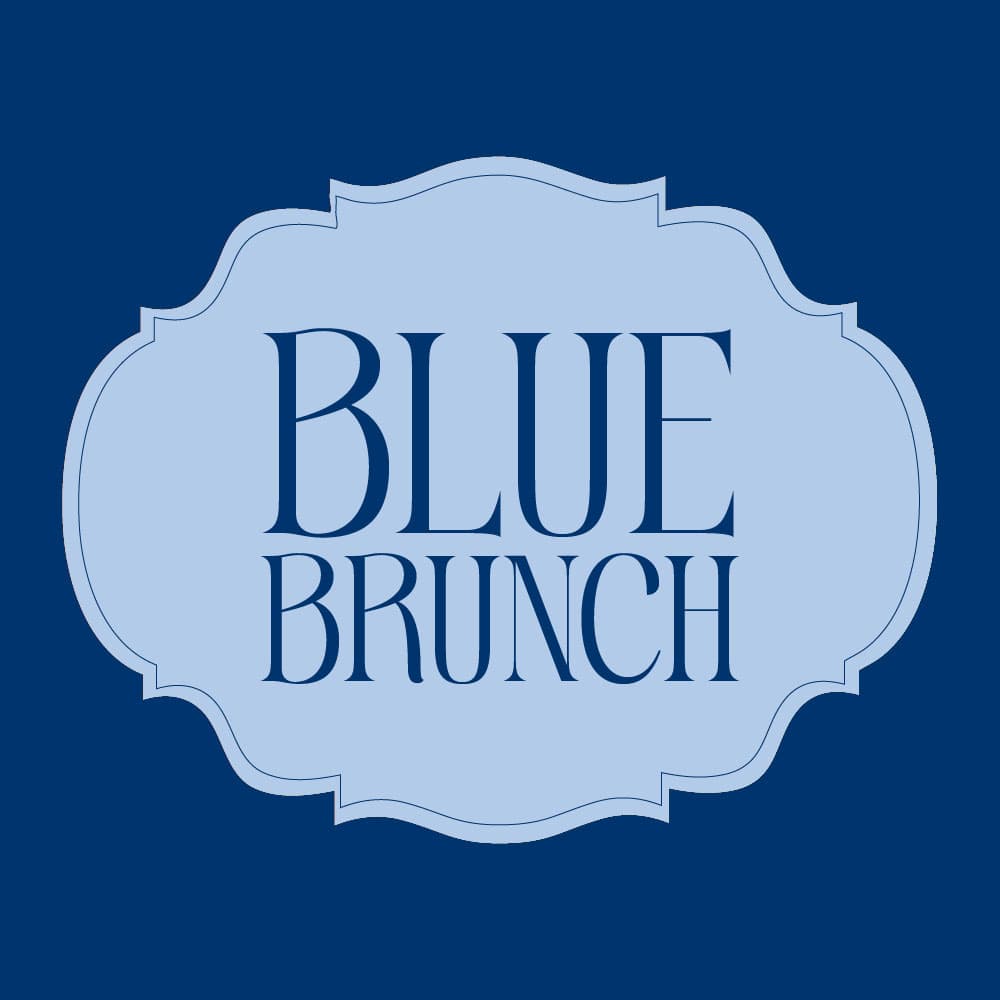
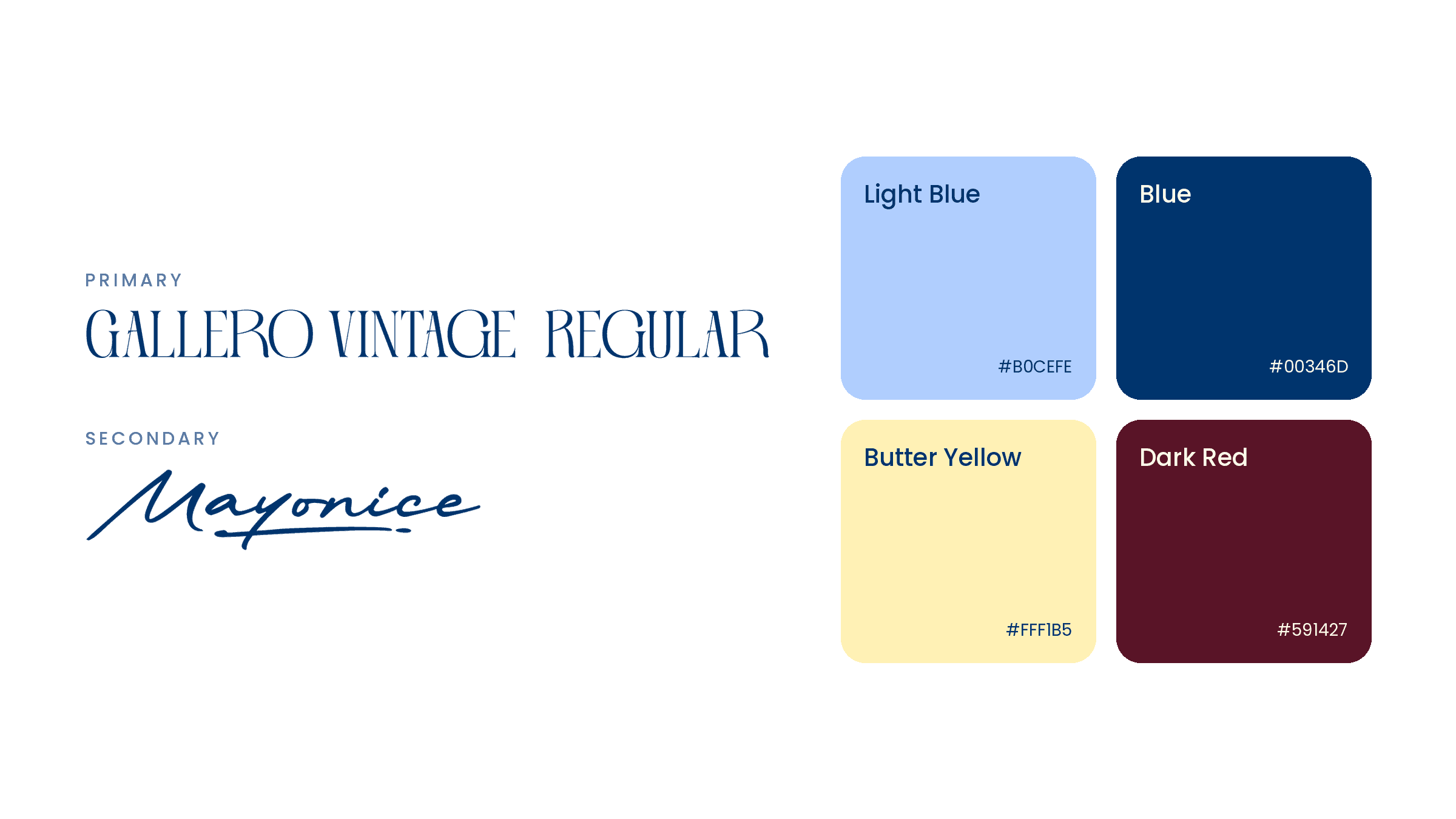
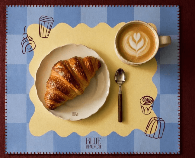
The wordmark is set in Gallero Vintage, a tall, high-contrast display face with interlocking letters. It reads like a fashion masthead, which is the point. The stacked lockup is the lead, with a horizontal version and a scalloped badge for stickers and seals. Mayonice, a loose handwritten script, carries the tagline and the menu title, so every formal moment gets a human one beside it. Three patterns do the heavy lifting: an elongated checker, a butter pinstripe and a wavy stripe. They come from tablecloths, awnings and café tiles, and they let a cup, a bag and a wall feel related without repeating the logo. A set of hand-drawn line illustrations, croissants, cups and canelés, adds the wink. The signage keeps to the same restraint: dimensional letters, a blade sign and a butter yellow A-frame.
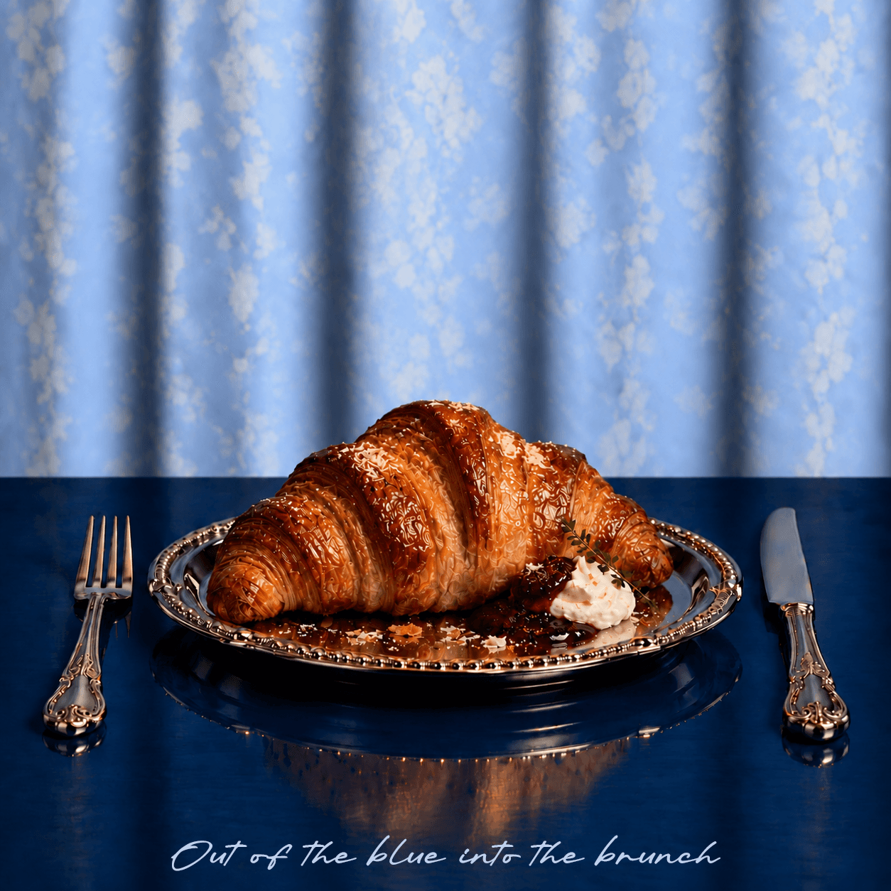
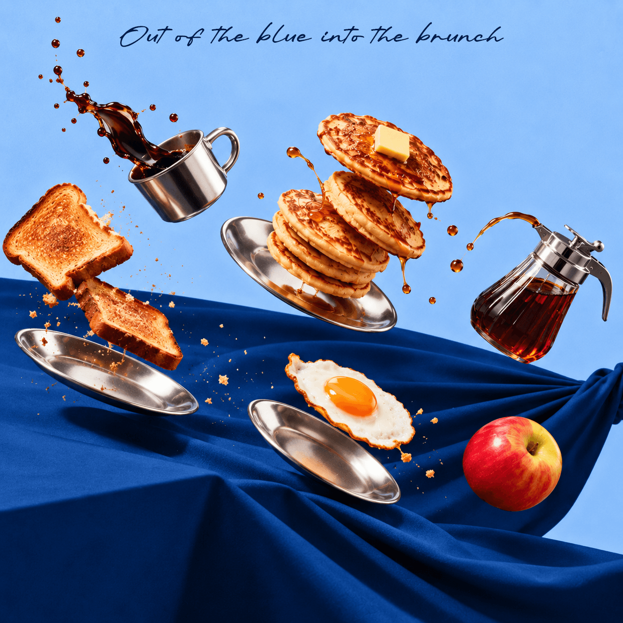
Out of the blue, into the brunch!
Packaging
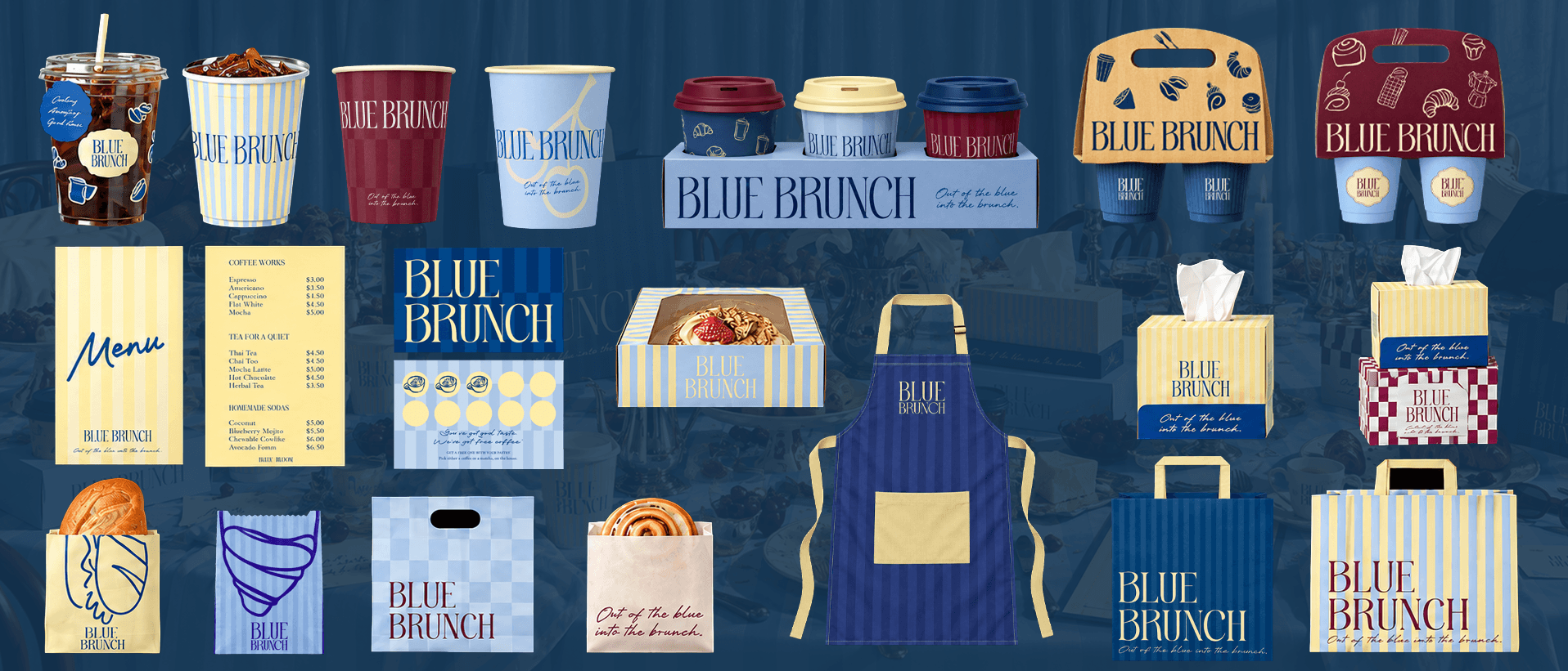
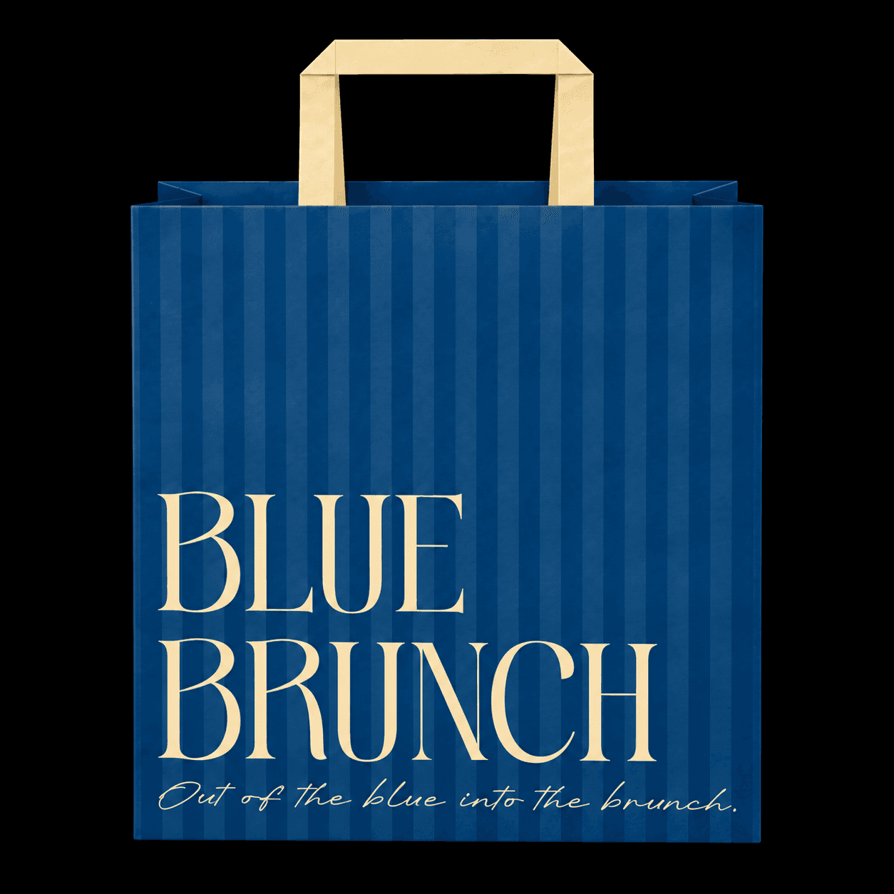
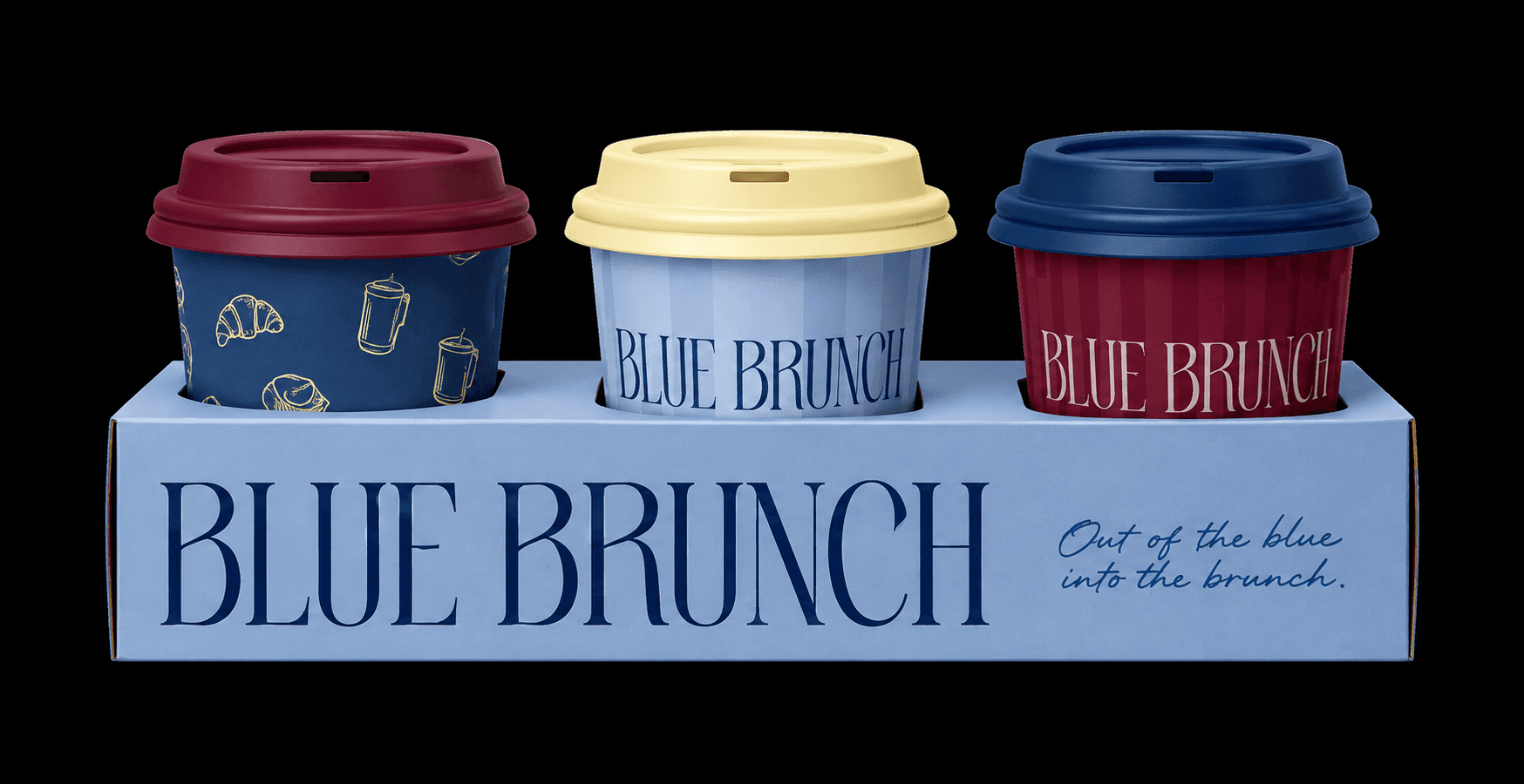
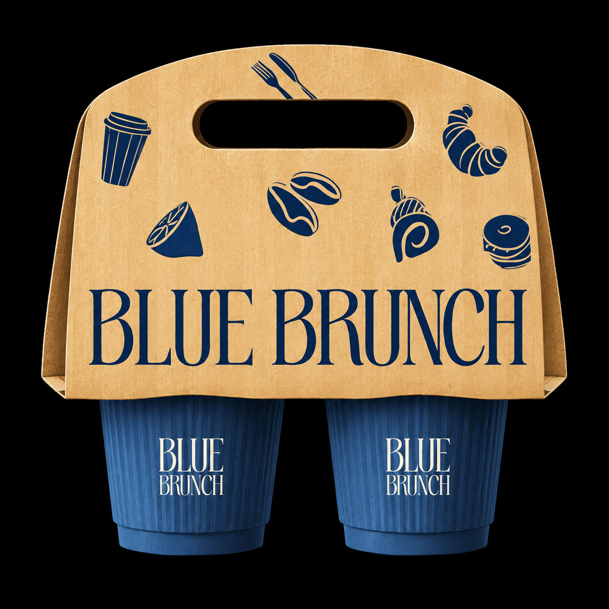
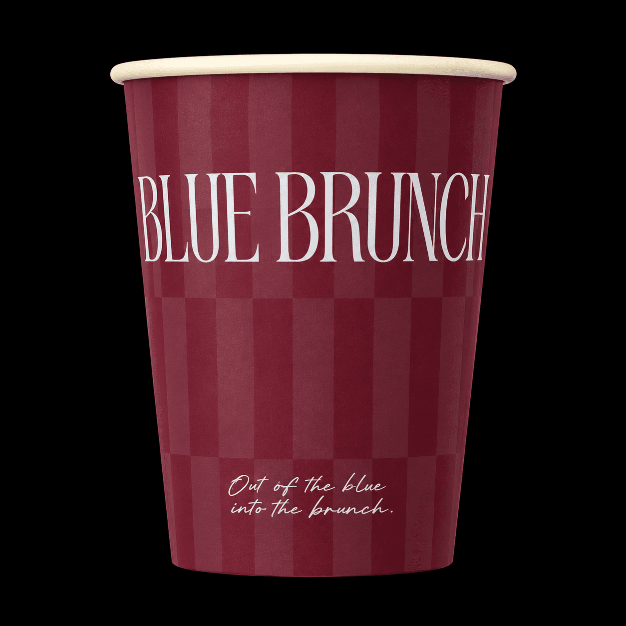
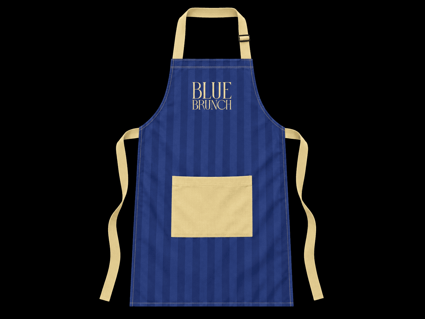
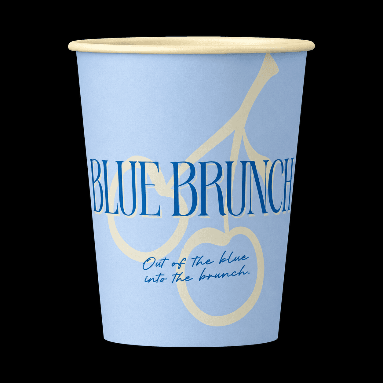
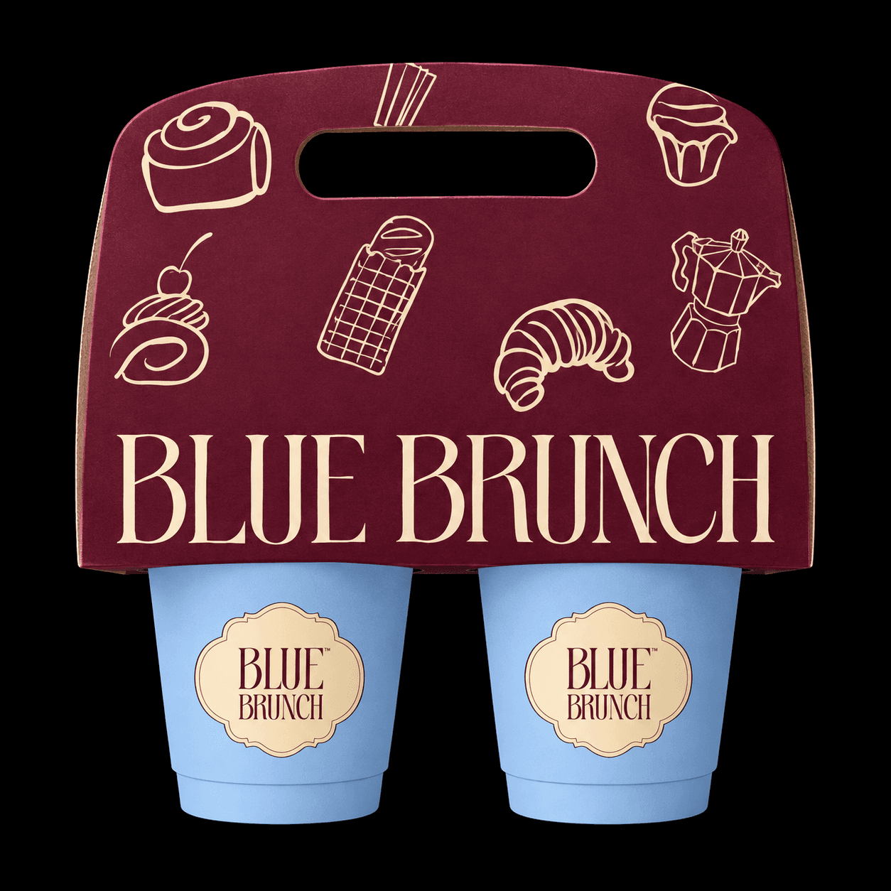
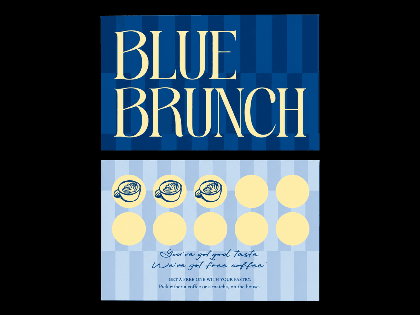
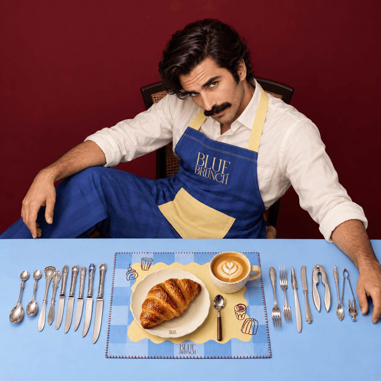
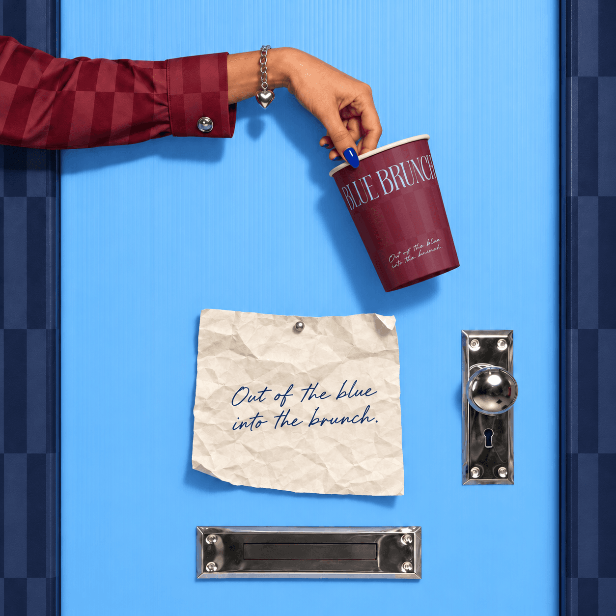
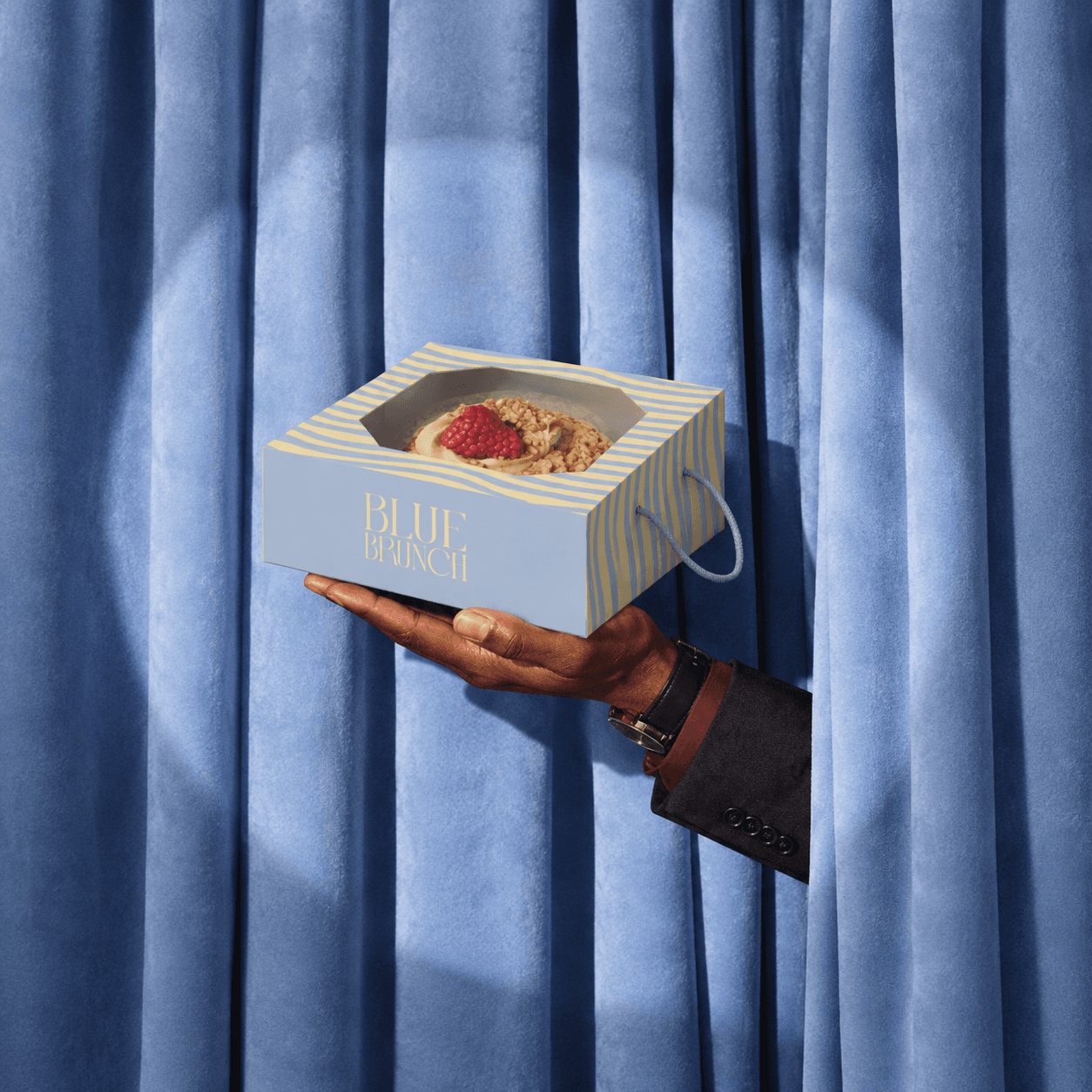
We designed the range as a wardrobe, not a uniform. No two cups match: butter pinstripe, burgundy checker, light blue with a cherry, clear iced cups covered in stickers. Put four on a table and they look like a group of friends. The same logic runs through the cup carriers, the espresso trio tray, the windowed cake box, the bread and croissant bags, the pastry sleeves and the shopping bags. We also branded the things cafés usually ignore: tissue boxes, placemats, loyalty cards, aprons. The tagline shows up small and handwritten, like a note left on the bag. Everything is built to be carried out of the door and photographed on the way.
Photography
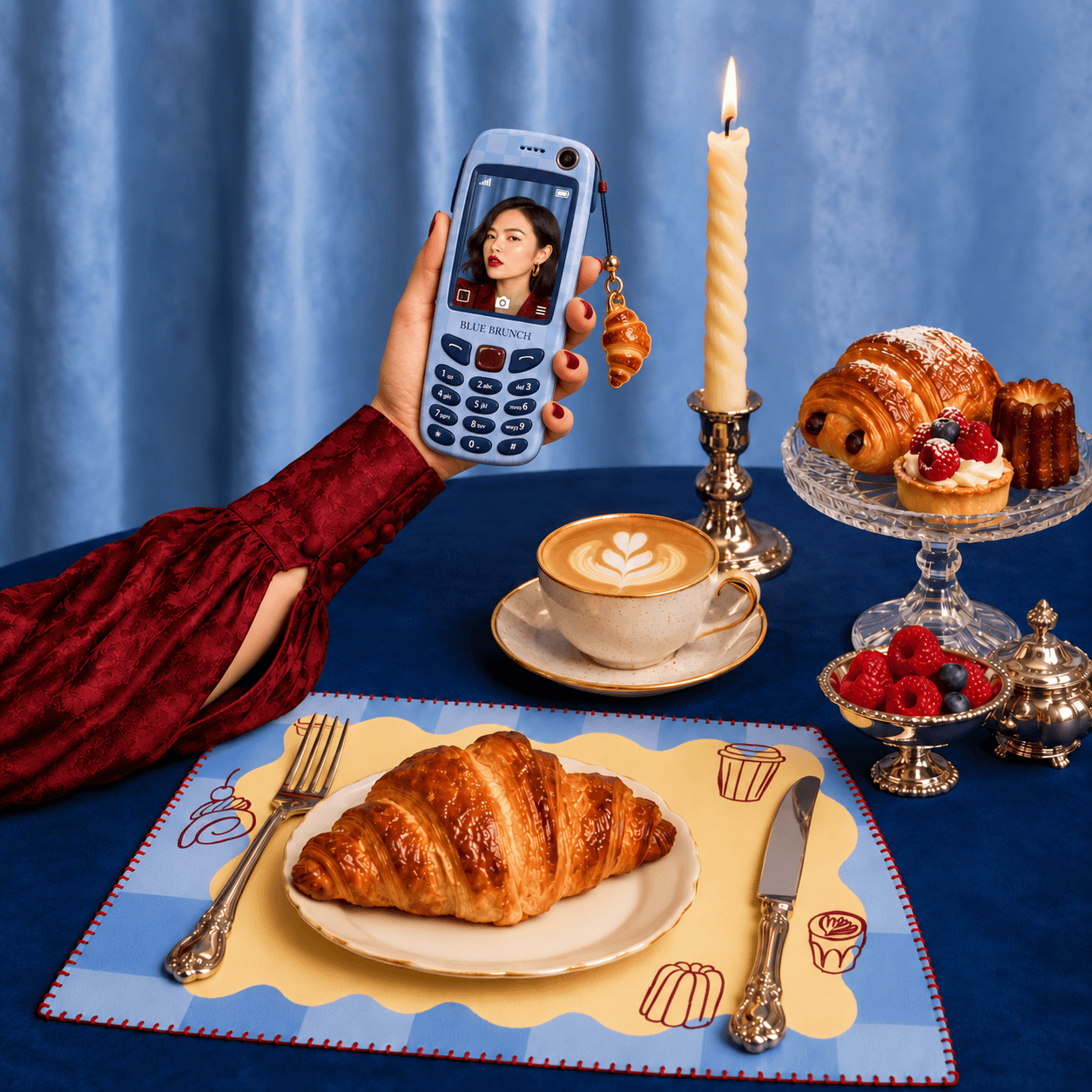
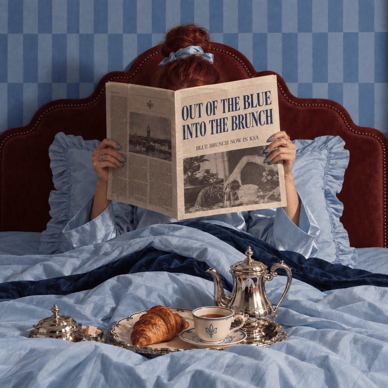
We wrote the rules before anyone picked up a camera. Hard flash, always. It flattens the scene, pops the color and gives every frame a 90s editorial, after-party feel. No soft window light, no beige. One rule cannot be broken: blue in every frame. A curtain, a candle, a tablecloth, a fingernail. If there is no blue, the shot does not ship. Around that we set the styling: tables that look lived in, crumbs left where they fell, hands in shot, high mixed with low, and one unexpected object per image. Each shot takes one of two grades, clean digital flash or a cool vintage film look.
Interiors
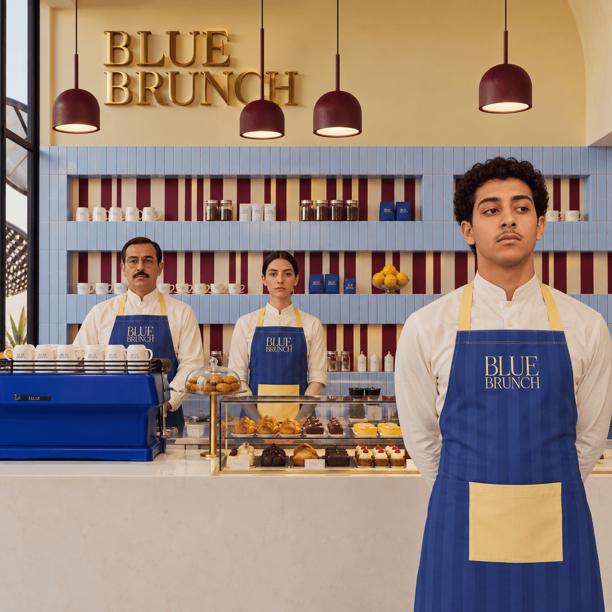
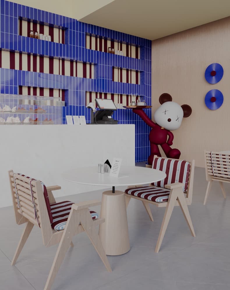
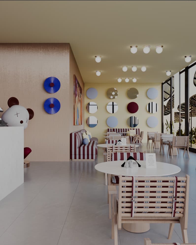
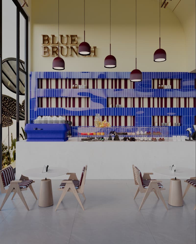
We designed the space in collaboration with OCD Studio, and treated it as the identity at full scale. Butter yellow walls, light blue tile running the length of the bar, and dark red stripes set into the shelving behind it. The palette that sits on a cup is the same one you walk into. Burgundy dome pendants hang low over a pale stone counter, the wordmark sits above in gold dimensional letters, and a cobalt espresso machine does the job of the blue prop rule before a photographer even arrives. The staff wear the striped blue apron with the butter pocket, so the people are part of the palette too. It is a room built to feel put together and easy to sit in for two hours.
The Result
Blue Brunch swapped a borrowed name for one it owns outright. The system is complete before the doors open: a strategy that says exactly who it is for, an identity with a clear point of view, packaging people will want to be seen carrying, and an art direction guide strict enough to keep every image on brand. It is polished and it is easy to be around, which is rare in this category. Jeddah gets a brunch brand with its feet up and its standards high.
Like what you see?