
A restrained visual language built around stillness, soft contrast, and a sense of arrival.
Client
Desert Light Co.
Year
2024
Services
Branding · Art Direction · Photography
The Brief
Desert Light Co. came to us with a name, a location, and a clear ambition: create a brand world that feels cinematic, calm, and unmistakably premium. We shaped the identity across print, packaging, photography, activation moments, and guest-facing marketing so the entire experience felt authored from the first glance to the final touchpoint.
The Challenge
The challenge was building a system that could feel minimal without becoming cold, and luxurious without slipping into something generic. Every application needed to balance warmth, restraint, and memorability across physical collateral, campaign imagery, spatial moments, and launch communications.
What We Did
We developed the core identity, art direction, packaging language, photography direction, event visuals, interior brand cues, and the broader rollout toolkit for launch. The result was a cohesive design system flexible enough for signage, guest materials, press moments, digital campaigns, and future seasonal storytelling.
Visual Identity

The mark and supporting typography were designed to feel timeless rather than trend-driven.

Applications leaned on spacious composition so imagery, texture, and typography could breathe.

The supporting asset system made the identity feel consistent across every guest-facing touchpoint.
We wanted the brand to feel like golden-hour silence - elegant, warm, and impossible to rush.
- Desert Light Co., Founder
Packaging
Primary packaging prototypes established the tactile tone for welcome kits and in-room details.
Material finishes were chosen to feel soft, grounded, and premium without becoming glossy or loud.

Label systems balanced utility and atmosphere, keeping information clear while preserving the mood.

Secondary touchpoints extended the same palette and typography into everyday guest rituals.
Presentation details were art directed to make even practical packaging feel part of the story.
Photography

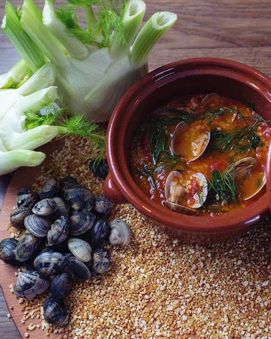
Photography centered on atmosphere, gesture, and a slow editorial sense of movement.
Close framing and quiet negative space made the imagery feel intimate rather than overtly commercial.
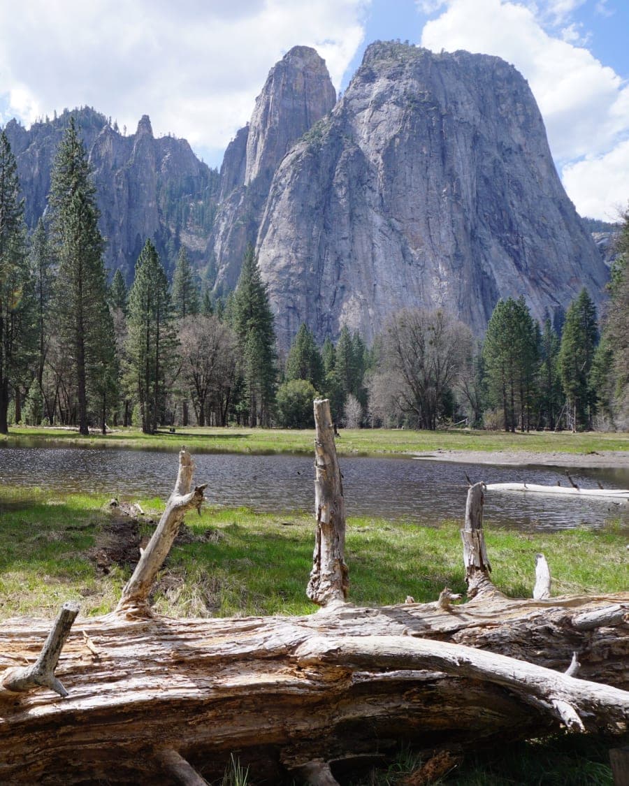
Landscape shots gave the brand a sense of place without overwhelming the identity system.
The final photography toolkit worked across launch, editorial, social, and print applications.
Activations + PR

Launch moments were designed to feel immersive and highly photogenic for press and invited guests.
Event collateral carried the same typographic confidence as the core identity.
Guest gifting and branded hospitality details helped the opening feel intentional from start to finish.
PR-ready photography gave the brand immediate assets for coverage, recaps, and post-event storytelling.
Spatial signage and branded moments anchored the guest journey during launch week.
Interiors
Interior brand cues were intentionally subtle, allowing the environment to feel authored but not overdesigned.
In-room materials extended the tactile palette through menus, room drops, and guest guidance.
Directional and environmental details gave the space a coherent visual rhythm.
Marketing
Campaign visuals were built to feel aspirational without losing the grounded warmth of the brand.
Paid and organic assets shared one visual rhythm so the rollout felt coherent across channels.
Social storytelling mixed atmosphere, product detail, and guest experience cues.
Performance assets were adapted from the same master system rather than designed as an afterthought.
Editorial-style campaign frames kept the launch communications feeling elevated and distinctive.
The rollout toolkit gave the internal team flexible templates without flattening the brand personality.
Colour Palette
Midnight Ember
#1A0A08
Desert Heat
#C9392E
Terracotta
#B0684D
Sand
#F2E6E4
Dusk Rose
#9E7570
A brand palette drawn from shadow, clay, heat, stone, and dust.
Typography
Light as Sand
Freight Display Pro
Serif
Aa Bb Cc 123
Aktiv Grotesk
Sans-Serif
Wayfinding / Notes / Details
Neue Haas Mono
Monospace
A cinematic display face, a neutral grotesque, and a precise mono layer for systems and wayfinding.
The Result
Desert Light launched with a fully realized identity system across print, packaging, guest experience, and digital marketing. The project gave the brand a polished launch presence, a cohesive content toolkit, and a visual language strong enough to scale into future campaigns, partnerships, and seasonal activations.
Like what you see?