
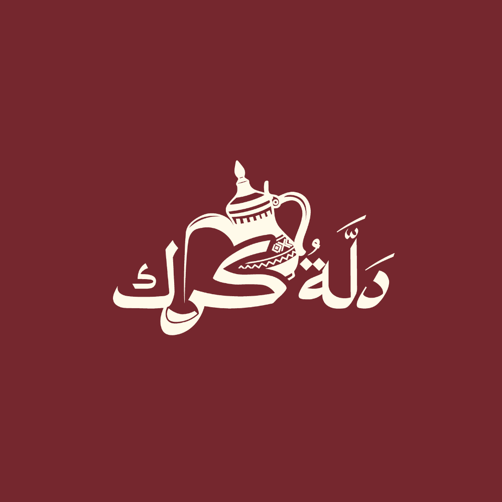

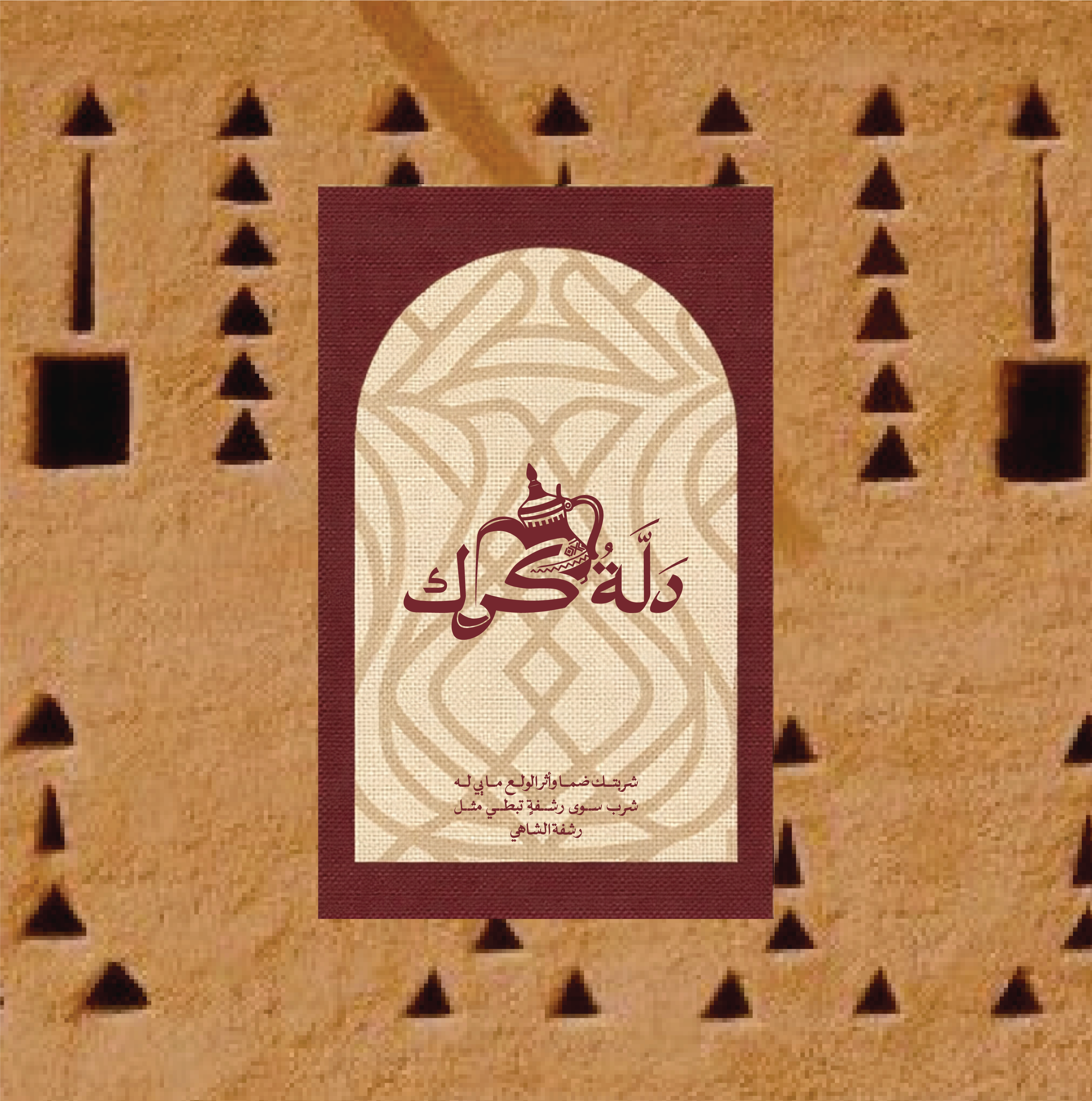
This is the primary logo for the brand with the main colorway
Client
Dallah Karak
Year
2026
Services
Branding · Photography · Art Direction · Copywriting
The Brief
Dallah Karak is a karak tea brand built on Qatari hospitality and brought into Egypt. We built the full identity, the visual world, the packaging system, and the interior direction for a brand that needed to feel like it came from the Gulf, not like it was inspired by it.
The Challenge
Egypt is full of "Gulf-style" cafes that borrow the aesthetics and skip the soul. Sadu patterns slapped on a wall, a dallah on the menu, and nothing underneath. Gulf residents in Egypt spot that instantly, and the Egyptians who love Gulf culture can tell when something is a costume rather than a place. Dallah Karak needed to sit in that exact tension and come out the other side as the real thing. Authentic enough for someone from Doha, desirable enough for someone from Cairo who has never been.
What We Did
We built Dallah Karak around one idea: this is a Qatari host who happens to be serving karak in Egypt, not an Egyptian cafe playing dress up. The brand archetype is Caregiver first, Ruler second. Generous and warm, but composed. A host with standards, never sloppy, never overdone. Everything in the system earns its place by serving that hospitality. The dallah itself became the spine of the visual identity, the logo, the packaging, the photography. We kept the cultural language Arabic-first and resisted any urge to localize the visuals for an Egyptian audience. The brand stays culturally intact on purpose. That's the entire point of it. We delivered the full brand identity, the packaging suite, social templates, an imagery and art direction guide, and the interior design direction for the physical space.
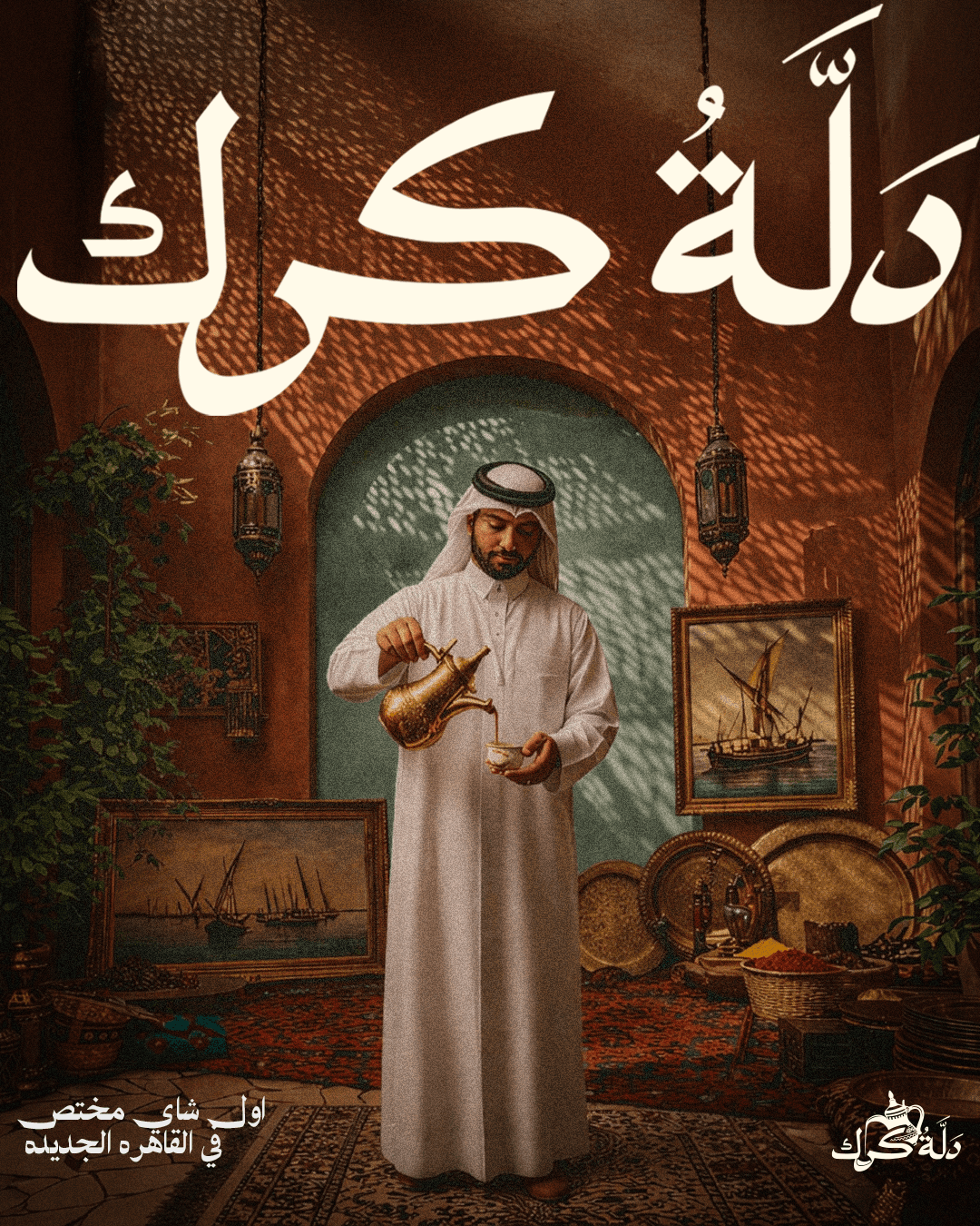
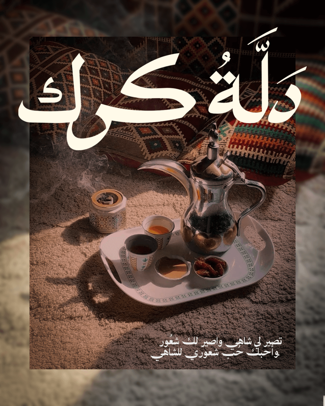
Visual Identity
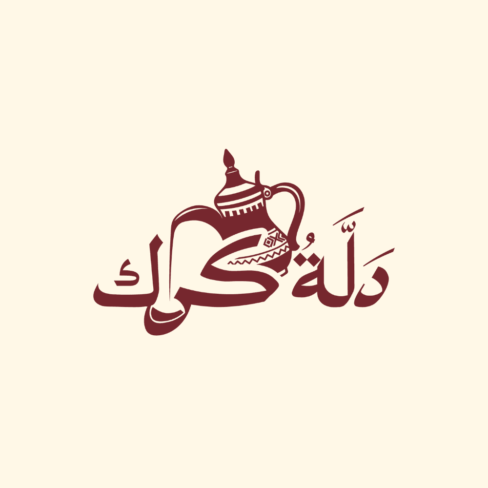
the reverse logo, we actually loved this one more but the client preferred the maroon one.
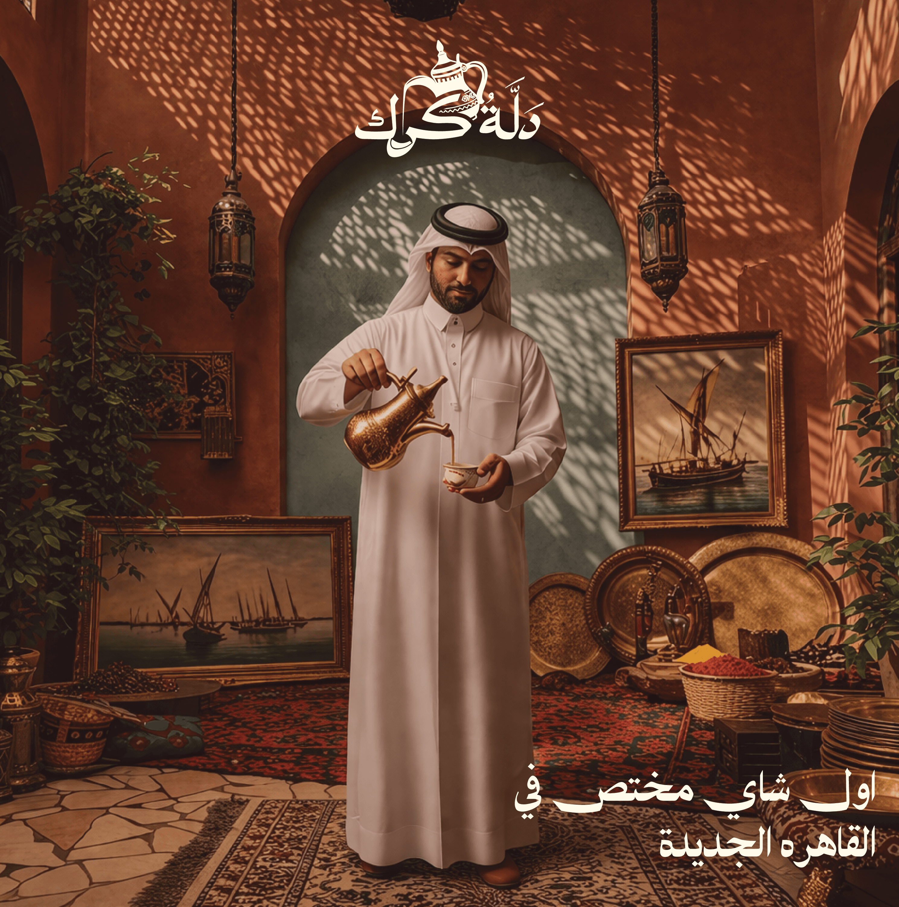
The first Qatari Speciality Tea in Egypt
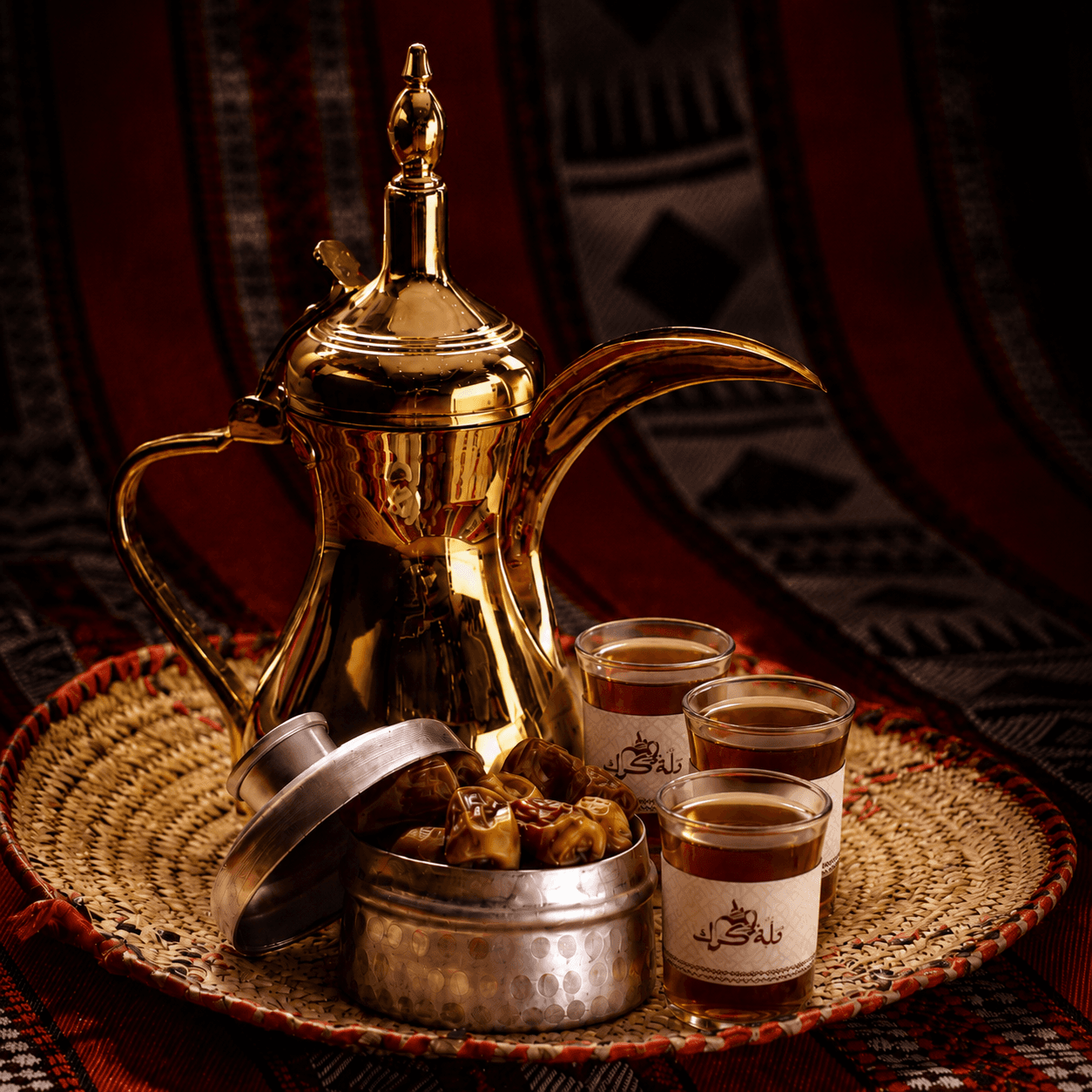
Packaging
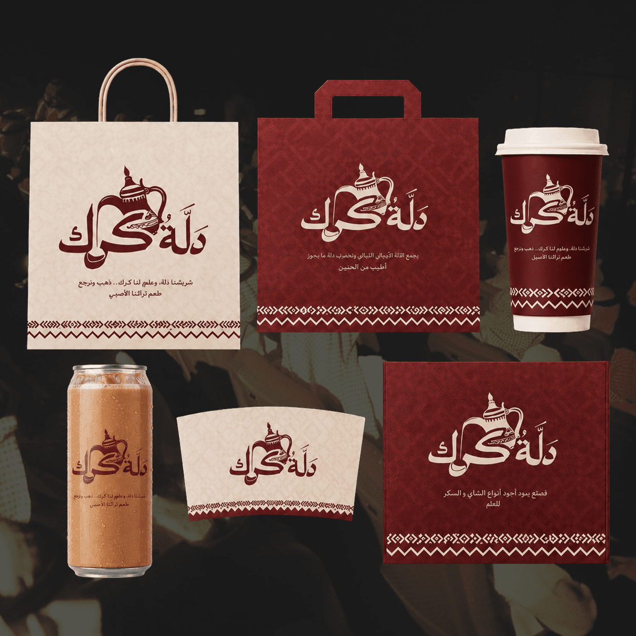
Full Package design for everything they needed, from cups to cans to bags and boxes.
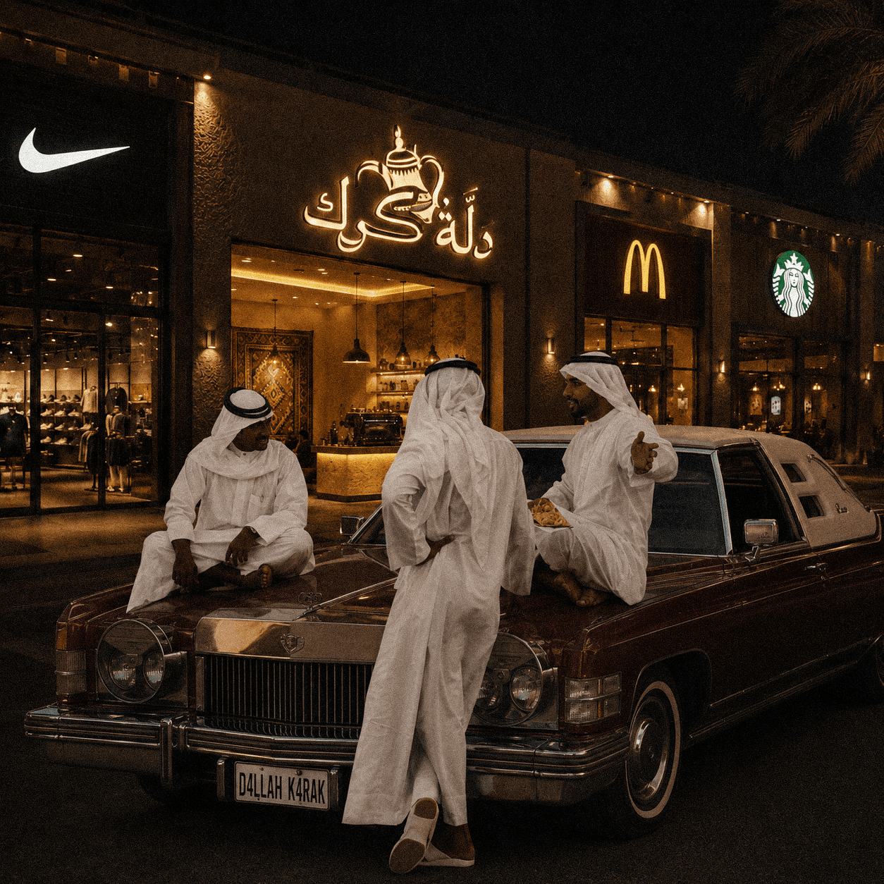
Royalty
How the client was feeling after seeing our work
You know we had to get jiggy with it
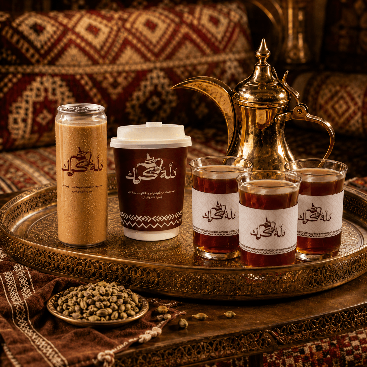
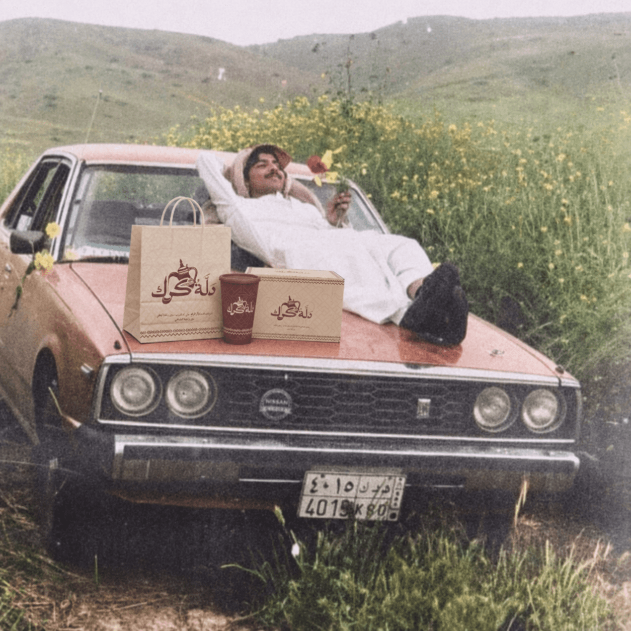
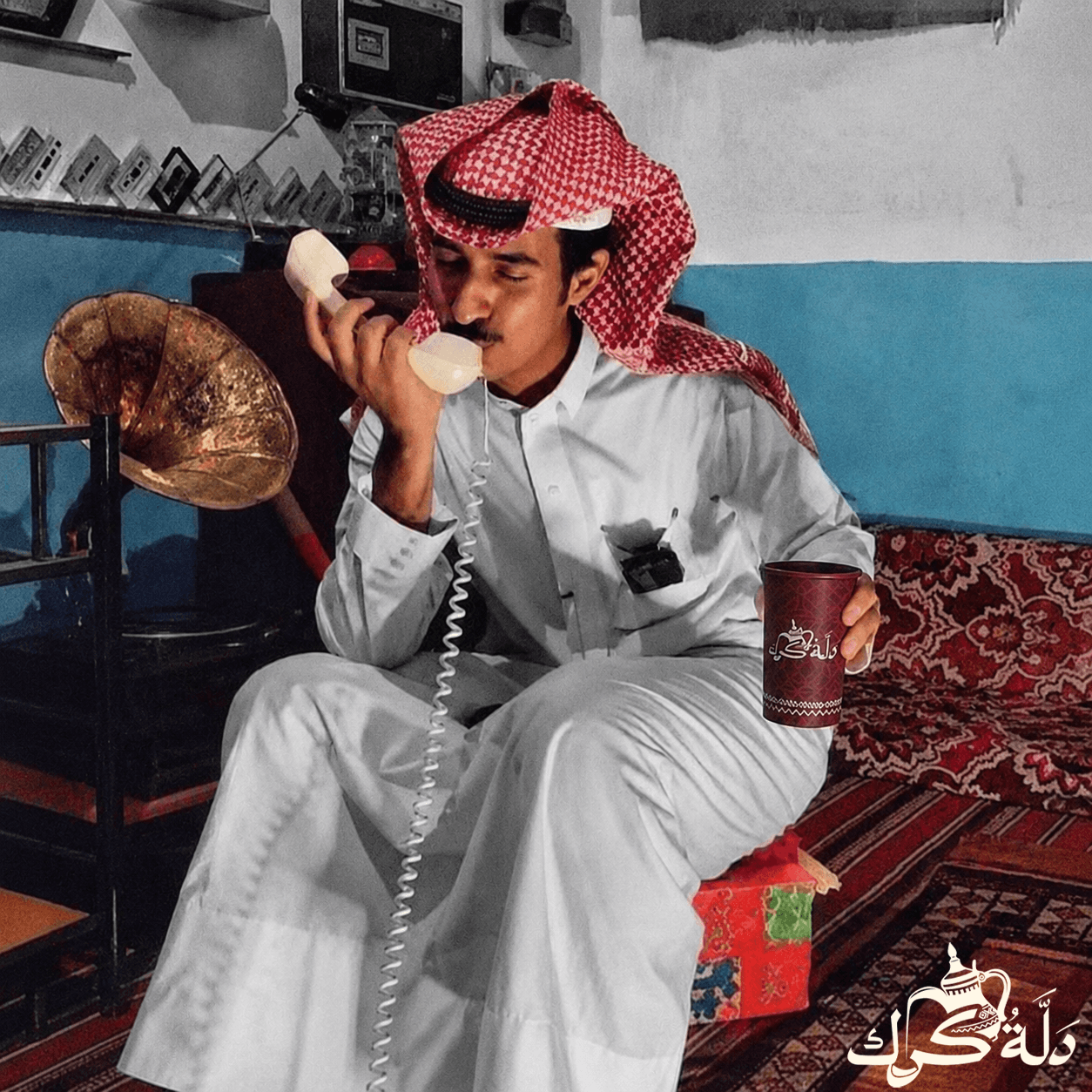
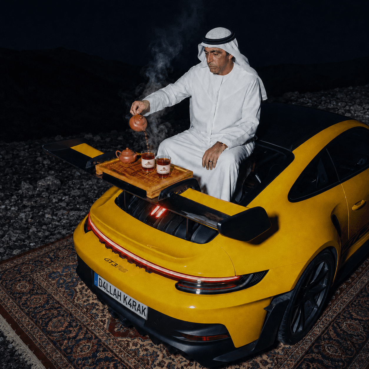
Photography
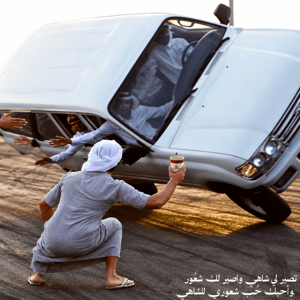
We had the idea to include arabic poems in the brand tonality.
Interiors
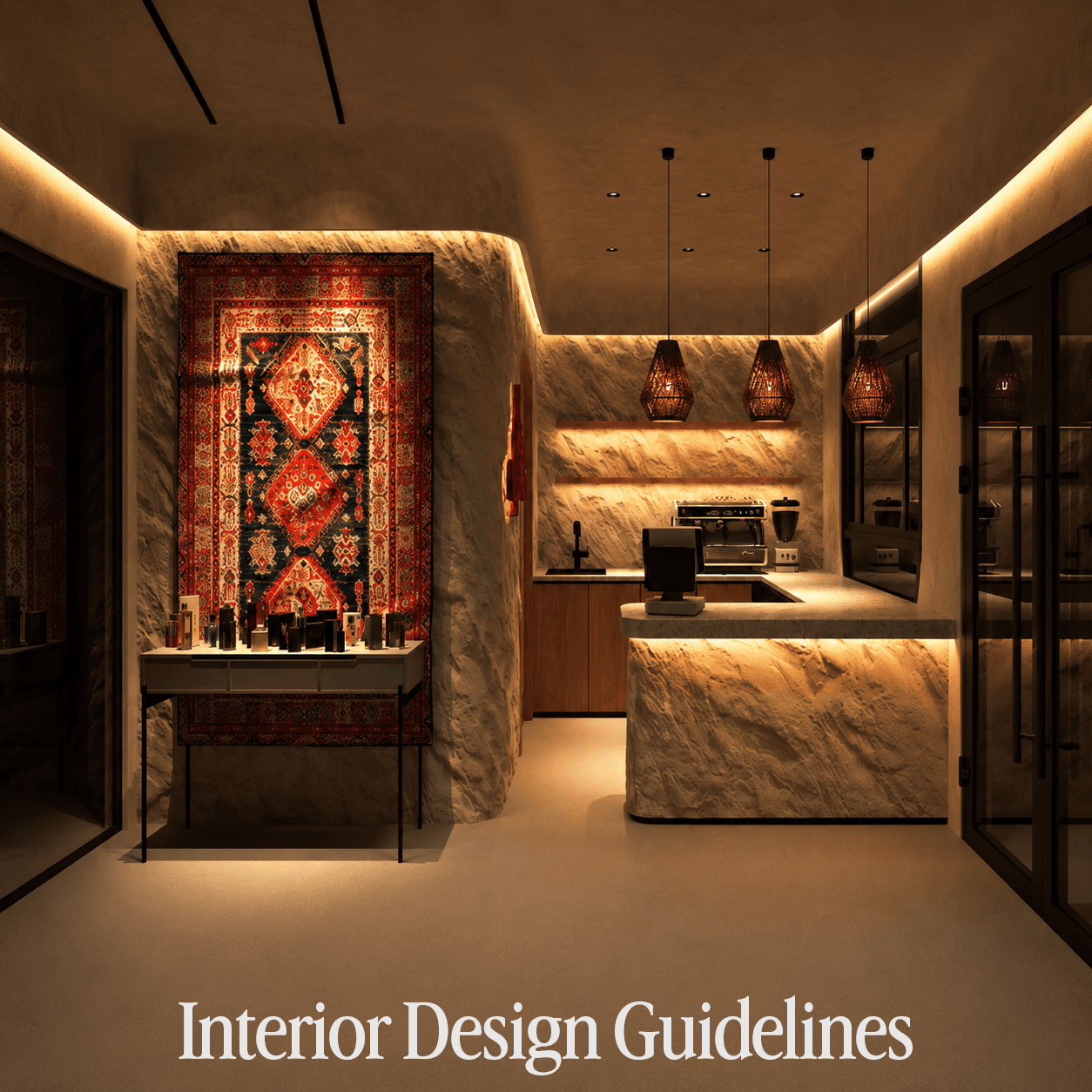
We did not design the space, but we gave strict guidelines so every brand thereafter feels the exact same.
Marketing
We didn't actually do the marketing for the brand, we provided some social media templates and examples and guidelines.
The Result
Dallah Karak doesn't read as a theme. It reads as a place with a point of view, where the dallah, the patterns, the light, and the language all come from the same root. Every touchpoint, from the can in someone's hand to the wall they're sitting against, carries the same quiet confidence. That's what makes it feel real instead of decorated, and it's what gives the brand room to grow without ever needing to explain itself.
Like what you see?